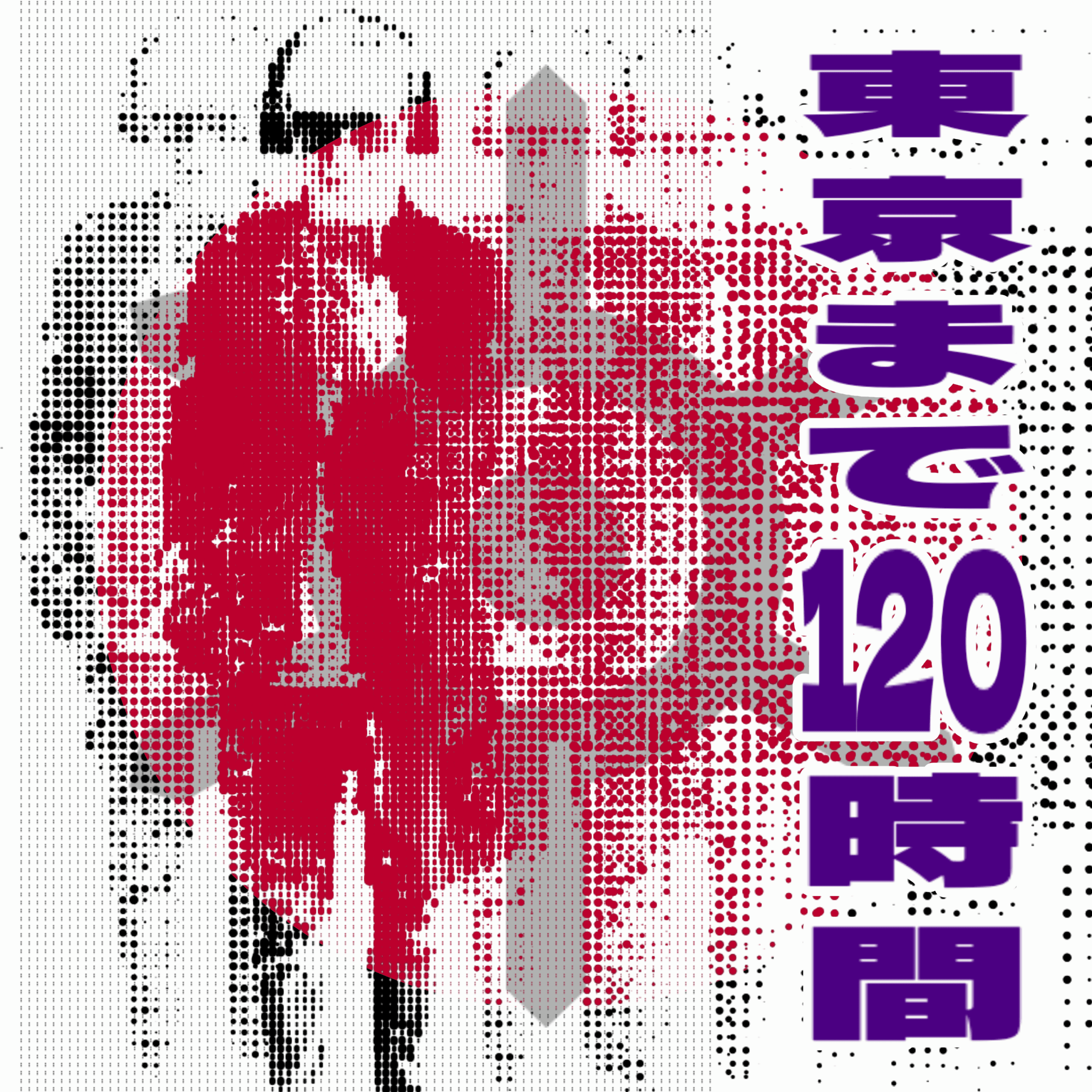
Borna Libertines discusses his album 120h to Tokyo in Interview with Magnetic Magazin, shaped by a six-month stay in Japan and released on July 1, 2026. He says Tokyo’s movement, nightlife, galleries, and jazz culture gave him the material for a record that blends hard techno, acid bass, live sax, and melodic detail.
He explains that the album follows a countdown from arrival to departure, inspired by a text noting 120 hours left before leaving. Libertines describes the record as his most cohesive release, with each track connected as part of a single arc.
Borna Libertines On The Six-Month Stay Behind 120h to Tokyo
Borna Libertines’(@borna_libertines) 120h to Tokyo plays like a record built from movement: airport arrival, train platforms, convenience-store loops, jazz bars, izakaya nights, small techno rooms, and the strange emotional compression that happens when a city only fully reveals itself once you know you have to leave. Released back on July 1, 2026, the eight-track album moves across hard techno, peaktime pressure, acid bass, live sax, and jazz-coded melodic detail while keeping its focus on one place.
The New York-based mixed-media collage artist and underground techno producer did not approach Tokyo as a quick stopover. After years split between Mexico City and New York, then time back home in Croatia, he landed in Japan with the explicit goal of staying as long as possible.
The trip stretched into six months, and the record came from what he absorbed there: the quiet inside the density, the vertical nightlife, the design language, the manga and anime references, the galleries in Harajuku and Omotesando, and the collision between Tokyo’s jazz history and its small-room techno culture.
The title came from a text near the end of the stay, when a friend reminded him there were only 120 hours left before departure. Borna turned that countdown into the album’s structure, sequencing the record from arrival to exit. In the interview below, he talks about why Tokyo pulled him in, how the city’s pace shaped the music, and why this is the first release in which every track genuinely speaks to the others.
Interview With Borna Libertines
What first brought you to Tokyo, and what was it about the city that turned the trip into a six-month stay?
I’d been splitting time between Mexico City and New York for about four years when I went home to Croatia that summer to see family.
The plan was to head back to NYC afterward, but something in me had grown tired of Western thinking, and of what felt like the inauthenticity around me. When I actually thought about where I wanted to be, Tokyo came to mind, precisely because it doesn’t run on that framework.
I landed with one goal: stay as long as I possibly could. The hospitality I met at every turn made that easy to justify.
When did you realize Tokyo had given you enough material, ideas, and emotion to carry an entire album?
Somewhere in the walking. The city sounds like nothing else: street crossings, subway announcements, convenience store jingles, crowds, and for how loud it seems on paper, it’s remarkably quiet in practice. There are over a hundred jazz bars in Tokyo, which connect to “Tokyo Freedom” and “Dancing With Tokyo,” most stacked floor to ceiling with vinyl, sitting blocks from small techno clubs. There’s also an art scene that opened up to me.
A few galleries in Harajuku and Omotesando, Joint Harajuku, tHE GALLERY Harajuku, and tHE GALLERY OMOTESANDO, took me in and introduced me to other artists and a community.
Add a design language and an infrastructure that doesn’t resemble anything in the West, and at some point it stopped being “material” and started being the album. And I forgot to mention manga and anime.
Where did the title 120h to Tokyo come from, and what does it say about your experience of the city?
It came from the end, not the beginning. I was in the last stretch of the stay, counting down the hours before I had to leave, and a friend texted me: “120h left.” That countdown became the record’s structure.
The whole album is sequenced from arrival to departure: “120h to Tokyo” is the journey to Tokyo, that excitement before arrival; “This is Tokyo” is first contact, train stations, crossings, convenience stores, crowds; “Night Over Tokyo” moves into piano, rolling bass, the slow build into an izakaya night, jazz bars, and small techno clubs; “Tokyo Freedom” is rolling bass and discovering Tokyo’s jazz history; “Dancing With Tokyo” is live sax, jazz-to-techno crossover, and Tokyo’s jazz bar history; “Tokyo Shunshin Desu” puts live sax over acid bass; “Tokyo Right Now Tokyo Right Here” is techno, acid bass, and presence over memory; and “This is Tokyo Extended” is the arrival, given room to close the record.
How did Tokyo’s nightlife influence the pacing of the record, especially when you sat down to translate those nights into music?
“This is Tokyo Extended” is where I tried to put all of it in one place.
Walking at night through Shinjuku, Shibuya, even Jimbocho, you’re already moving at 140 BPM. The neon, the ads, the bars, it kicks like a 4/4 techno pulse before you’ve touched a single instrument. Tokyo is also vertical in a way most cities aren’t: a bar on the fourth floor, a gallery on the 42nd. So you can spend an entire night in one building, moving up through it the way a track moves through its drops and builds.
Clubs run until 9 a.m. on weekends, so the pacing isn’t really a choice I made. It’s the pacing the city already has.
Was there one track that took longer to figure out, and what finally helped you understand what it needed to become?
“Night Over Tokyo.” I had the melody and the piano roll early and loved them, but I didn’t want to let them resolve.
I wanted them to keep carrying forward. Adding the TB-303 and a rolling kick and hi-hats let me stretch it into something that traces an actual night out: the slow start at an izakaya, the subway ride, arriving at a club where the melody is what pulls you through the city.
What does 120h to Tokyo reveal about you as an artist that listeners wouldn’t have heard in your earlier releases?
Cohesion. This is the first time every song genuinely speaks to the others. You can hear one track inside another, and the record moves as a single arc rather than a collection. That’s new for me.
Closing Thoughts
The most convincing part of Borna Libertines’ explanation is that Tokyo does not appear as a moodboard.
It appears as a system of motion. Train stations, crossings, jazz bars, subway rides, galleries, convenience-store sounds, late-night buildings, and 9 a.m. club exits all become part of the sequencing. That is why the countdown idea works. 120h to Tokyo is less concerned with presenting a postcard version of the city and more interested in what happens when time starts running out, and every detail becomes easier to hear.
That places the record near our interview with Ken Ishii on Syntax Error, exposure, and staying focused across 30 years in techno. Ishii’s perspective came from inside Japanese techno history, while Borna is approaching Tokyo as an outsider whose stay became long enough to alter the record’s entire shape. The link between the two pieces is discipline. Both suggest that techno becomes more interesting when it responds to place without reducing place to decoration.
There is also a line to our Eli Brown interview on techno, tension, and why genre means less in the booth. Borna is working in a harder, more peaktime register here, but the deeper point is similar: the record is organized around movement, pressure, and how energy changes once the room starts pulling it forward.
His description of Tokyo already moving at 140 BPM before he touches an instrument says a lot about how he hears the city. The tempo is not only a production decision. It is a way of translating the pace around him.
That is where 120h to Tokyo feels like a real step for him.
Borna says the word himself: cohesion. The record has individual club moments, but it is built to move as one piece, with jazz history, acid bass, live sax, hard techno pressure, and arrival-departure pacing feeding back into each other. The result is a city album that does not ask Tokyo to stand still. It follows the city while it moves, then uses the last 120 hours to make the motion feel finite.
Borna Libertines’ eight-track LP 120h to Tokyo blends driving techno with atmospheric passages built around real field recordings from Tokyo. The album moves steadily through 138–140 BPM material while using layered textures and found sounds to create a cohesive city-focused soundscape.
Jazz saxophone appears on standout tracks such as “Dancing with Tokyo” and “Tokyo shunshin desu,” adding contrast to the analog production. The closing extended version of “This is Tokyo” reinforces the album’s front-to-back structure and full-length focus.
Borna Libertines – 120h to Tokyo
NYC-based visual artist and producer Borna Libertines steps fully into the booth with 120h to Tokyo, an eight-track LP that plays like a five-day fever dream of the city itself. Sitting comfortably in the 138–140 BPM pocket, the record moves through peak-time drivers and slower, more atmospheric cuts without ever losing its throughline: real field recordings from Tokyo’s streets woven straight into the mix, giving tracks like “Night over Tokyo” and “Tokyo right now Tokyo right here” a documentary edge most techno records don’t bother reaching for.
The standout moment comes with “Dancing with Tokyo” and “Tokyo shunshin desu,” where jazz saxophone cuts through the analog haze – an unexpected but welcome detour that separates this from the pack of straight-ahead peak-time records. It’s a nice reminder that Borna’s background as a collage artist shows up in the production too: layering, texture, found sound, nothing quite where you’d expect it.
Closing out with an extended cut of “This is Tokyo,” the LP rewards a full front-to-back listen rather than cherry-picking singles. For a producer who’s spent as much time on gallery walls as on modular racks, 120h to Tokyo is a confident, cohesive first full-length statement.
120h to Tokyo | Tokyo Techno LP by Borna Libertines
Tokyo techno arrives on its own terms with 120h to Tokyo, Borna Libertines’ eight-track LP landing July 1, 2026. Built on analog synths, modular sequences, and a kick riding 138–140 BPM, the record maps the city as frequency — urban motion translated into machine rhythm, uplifting without ever resolving into comfort. Jazz fragments surface through saxophone lines before the acid bass reclaims the floor. That same collision between cultures and surfaces drives Borna’s collage and graffiti practice — imagery stripped, recombined, made to carry more than its origin. Eight tracks, thirty-two minutes: stream the full release at Music or on Apple Music, Amazon Music, and YouTube Music. 🎵
4. TRACK GUIDE
1. 120h to Tokyo(4:10, 140 BPM) — The opener encodes the journey: a propulsive modular framework that converts anticipation into forward motion, the departure running at full tempo.
2. This Is Tokyo(3:10, 140 BPM) — First contact. Acid bass opens the city’s grid; an uplifting chord structure carries the weight of arrival without sentiment.
3. Night Over Tokyo(6:41, 140 BPM) — The centrepiece. Piano over a rolling bassline, six and a half minutes of the city after dark — the record’s most atmospheric track, earning every second.
4. Tokyo Freedom(3:12, 140 BPM) — Emotional peak at full tempo. The rolling bass cuts loose; movement without destination, the city at speed.
5. Dancing With Tokyo(4:03, 138 BPM) — Saxophone enters the machine, bending jazz vocabulary into techno grammar. The EP’s most cinematically textured four minutes.
6. Tokyo Shunshin Desu(2:45, 140 BPM) — Compact and sharp: sax and acid bass in direct collision, a two-minute forty-five-second distillation of the jazz-to-techno transmission.
7. Tokyo Right Now Tokyo Right Here(3:16, 140 BPM) — Presence over memory. Acid bass at full tilt; techno as an act of immediate experience, no nostalgia.
8. This Is Tokyo (Extended)(5:07, 140 BPM) — The arrival given room: the original’s structure expanded and deepened into a proper closer.
Yugen (幽玄) is perhaps the most elusive of Japanese aesthetic principles. It translates as “profound grace,” “mysterious profundity,” or “subtle depth.” Yugen represents the beauty that lies just beyond perception—what is suggested rather than shown, implied rather than stated. It is an awareness of the universe that transcends intellectual understanding.
Core Definition: Yugen is the aesthetic of suggestion and mystery—finding beauty in incompleteness, in what is hidden, in the space between what is said and what is understood.
Philosophical Foundations
Rooted in Buddhist philosophy, Yugen acknowledges that much of existence lies beyond human comprehension. Rather than trying to capture or explain all experience, Yugen invites us to find beauty in partial understanding, in the unknowable, and in the contemplative power of mystery.
Yugen requires active participation from the viewer or reader. It is not art that explains itself, but art that invites personal interpretation and imaginative completion.
Core Characteristics of Yugen
Suggestion over revelation: Showing less to imply more; incompleteness as artistic strategy.
Atmospheric depth: Creating mood through subtle visual and emotional cues.
Viewer participation: Engaging imagination and personal interpretation.
Poetic resonance: Beauty that transcends literal meaning to touch deeper awareness.
Ineffable quality: Excellence that exceeds technical description or rational analysis.
Yugen in Traditional Japanese Art
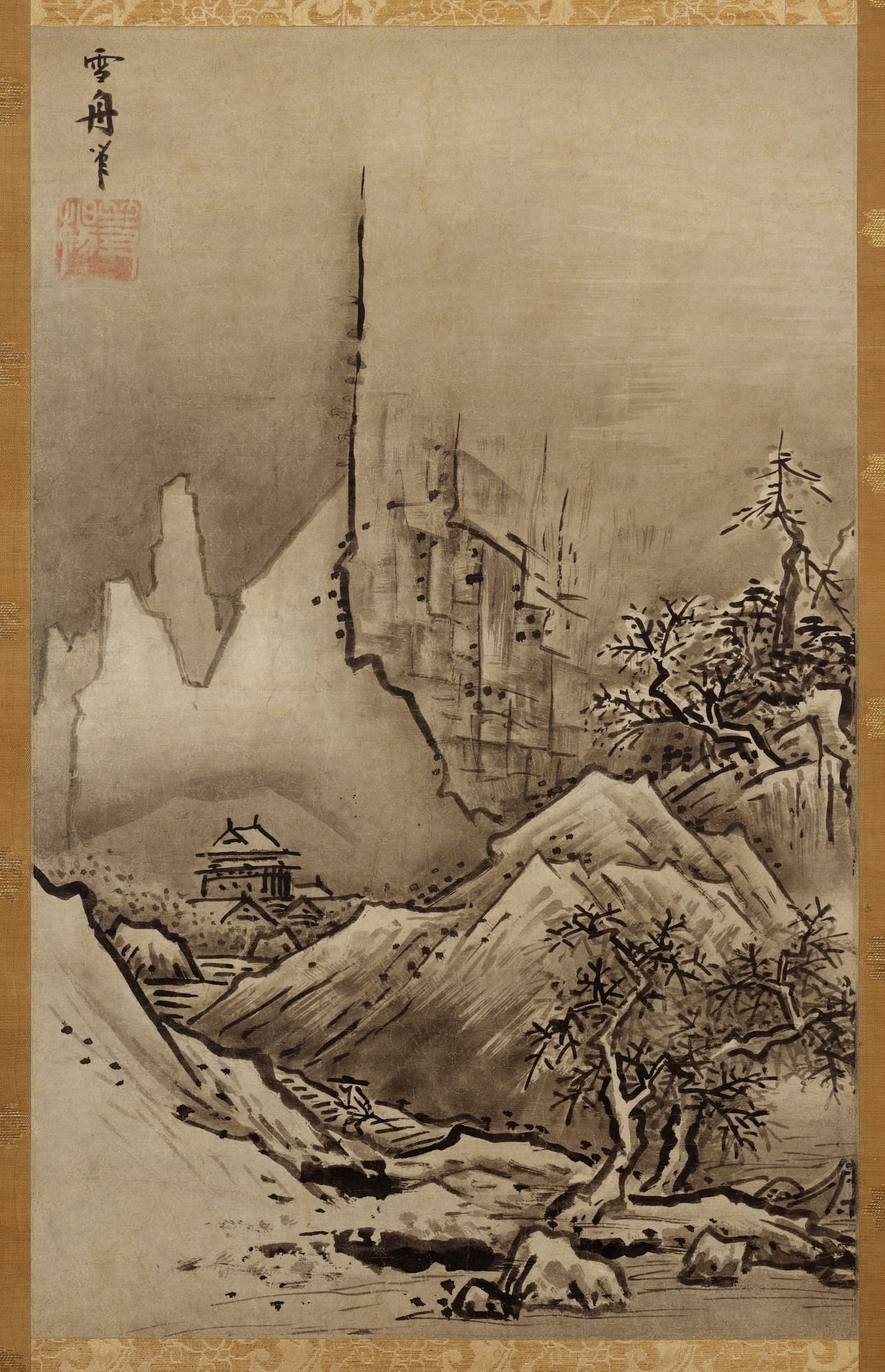
Sesshu Fisherman
Sumi-e Painting
In traditional ink painting, Yugen manifests through minimal brushwork and strategic emptiness. Vast landscapes are suggested through minimal marks; mist and fog are represented as unpainted paper; distant mountains appear as faint gray washes. Viewers imaginatively complete the scene, becoming co-creators with the artist.
Example: A Sumi-e landscape depicting mountains behind clouds might show only a few brushstrokes suggesting peaks, with vast empty paper representing mist. The viewer must engage their imagination to complete the landscape, creating personal resonance with the image.
Japanese Poetry and Haiku
The seventeen syllables of haiku never explain or elaborate. Instead, they gesture toward profound truths about nature, seasons, and existence. Readers generate their own complete understanding from minimal words, creating personal connections to universal experiences.
Yugen in Contemporary Design
In modern design, Yugen appears as atmospheric lighting that suggests rather than illuminates, generous negative space that invites contemplation, and interface design that guides through suggestion rather than explicit instruction. The most elegant contemporary products often feel intuitive through their restraint and subtle indication of functionality.
Applying Yugen to Creative Work
Visual Design
Use atmospheric lighting and shadow to create mood
Leave space for viewer imagination and interpretation
Suggest meaning rather than stating it explicitly
Layer subtle details that reward close observation
Writing and Storytelling
In literature, Yugen principles guide writers to leave gaps in narrative, allowing readers to complete stories through imagination. The most emotionally resonant writing often suggests more than it explains, inviting readers into deeper participation.
SEO Keywords for Yugen: Yugen principle profound grace mystery in art subtle beauty mysterious depth
Yugen vs. Explicit Expression
In contrast to Western traditions that value clear communication and explicit expression, Yugen celebrates what is left unsaid. This principle recognizes that the most profound beauty often lies in ambiguity, suggestion, and the space between understanding—inviting viewers to transcend rational thought and access deeper awareness.
The Transcendent Power of Yugen
Yugen teaches that the most profound beauty often exceeds our ability to articulate it. By embracing mystery, suggestion, and incompleteness, artists create work that touches something beyond intellectual understanding—something that lingers in memory and continues to resonate with personal significance long after first encounter. This principle explains why certain artworks seem to deepen rather than exhaust themselves with repeated exposure.
Shibui Aesthetic: The Quiet Depth of Japanese Design and Art
Shibui is a foundational concept in Japanese aesthetics, expressing a refined beauty rooted in subtlety, restraint, and depth that reveals itself over time.
What Is Shibui?
Shibui (渋い) is a central principle of Japanese aesthetics that describes a form of beauty that is understated, quiet, and deeply refined. Unlike overt or decorative beauty, the Shibui aesthetic reveals itself gradually through time, observation, and use. It values simplicity infused with complexity, elegance without display, and depth without excess.
Originally used to describe an astringent or bitter taste—such as strong green tea or unripe persimmons—Shibui evolved into an aesthetic term signifying mature refinement. What Shibui does not impress instantly, it rewards patience and familiarity.
Philosophical Foundations of the Shibui Aesthetic
The Shibui design philosophy developed through Zen Buddhism, the Japanese tea ceremony, and centuries of craftsmanship. These traditions emphasize mindfulness, restraint, and respect for materials. Shibui does not eliminate complexity; instead, it conceals complexity beneath an unassuming surface.
Unlike Western minimalism, which often seeks reduction until nothing remains, Shibui focuses on what is left behind—texture, material richness, tonal variation, and emotional depth. This distinction is essential when comparing Shibui vs minimalism.
Core Characteristics of Shibui
Subtle depth revealed through time
Muted, earthy color palettes
Material honesty and natural aging
Functional elegance without ornament
Textural richness and patina
These characteristics allow Shibui objects and spaces to mature gracefully, gaining presence rather than losing relevance.
Shibui in Art and Painting
In Japanese art, Shibui is most clearly expressed through sumi-e (ink wash painting), where artists use minimal means—black ink, water, and negative space—to create atmospheric depth.
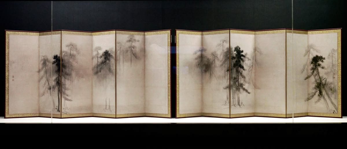
A defining example of Shibui art and painting is Hasegawa Tōhaku’sPine Trees screens, where mist, silence, and restraint evoke profound emotional presence without detailed representation.
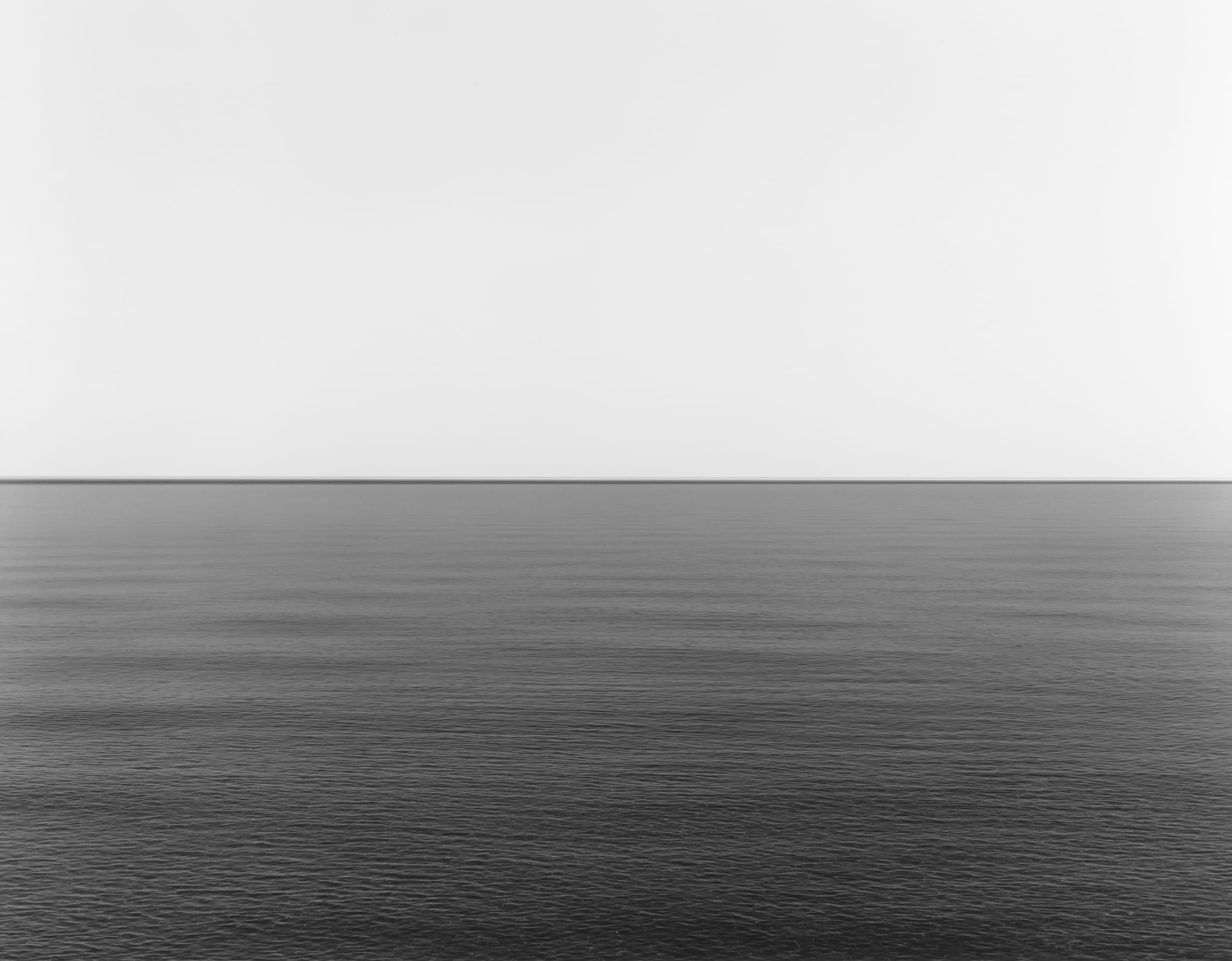
In modern contexts, photographers such as Hiroshi Sugimoto continue this tradition. His Seascapes series reduces the image to horizon, water, and sky, creating nearly monochromatic works
Shibui in Architecture and Interior Design
Shibui architecture prioritizes material honesty and the interaction between light, shadow, and surface. Architect Tadao Ando exemplifies Shibui in modern design through the use of smooth, cast-in-place concrete that changes character throughout the day.
The beauty in Shibui architecture lies not in decoration, but in proportion, silence, and time. Similarly, contemporary architect Kengo Kuma integrates layered wood and textile-like structures to create transparency and softness while maintaining structural clarity.
Shibui interiors favor natural materials such as linen, stone, washi paper, and wood, combined with low-profile furniture and earthy neutrals. The goal is mental calm rather than visual dominance.
Shibui in Modern Product and Digital Design
In the 21st century, Shibui has become a global reference point for timeless, human-centered design. Japanese brand Muji embodies the Shibui aesthetic through unbranded, functional products designed to gain character through daily use.
Even digital interfaces reflect Shibui principles. Apple’s interface design employs muted color schemes, subtle motion, and generous negative space, creating experiences that feel refined without demanding attention.
Historical Influence and Global Reach
During the mid-20th century, Shibui entered Western design discourse, influencing Mid-Century Modern architecture and furniture. Designers and publications promoted durability, organic form, and quiet sophistication over decorative excess.
Today, Shibui continues to shape Japanese minimalist design, global branding, contemporary art, and architecture—standing as a counterbalance to spectacle-driven aesthetics.
Why the Shibui Aesthetic Matters Today
In an age of overstimulation and rapid consumption, Shibui offers an alternative vision of beauty—one grounded in patience, authenticity, and depth. It reminds us that the most enduring design does not shout. It whispers, matures, and remains.
The influence of Shibui (subtle beauty) in modern painting and design is profound, evolving from a traditional concept into a global standard for “sophisticated restraint”. Unlike western minimalism, which often seeks to strip away until nothing is left, Shibui focuses on what is left behind—the quiet depth, the richness of materials, and the beauty that reveals itself only to the patient observer.
Shibui in Modern Painting and Photography
In modern art, Shibui manifests as a rejection of “loud” or “spectacular” beauty in favor of atmospheric depth and “silvery” palettes.
Atmospheric Photography (Hiroshi Sugimoto):
Contemporary photographer Hiroshi Sugimoto’s Seascapes series is a pinnacle of modern Shibui. By using long exposures to capture the horizon where sea meets sky, he creates a nearly monochromatic, “quiet” image that initially appears simple but reveals infinite gradations of light and texture upon closer look.
SUGI150003 Studio
The “Silvery” Color Palette:
Modern painters influenced by Shibui often “muddy” primary colors with gray tones to create a coordinated, somber scheme. Large areas are typically dark and rich, punctuated by a single “astringent” or sharp color—like a splash of deep orange on a charcoal canvas—to add a “hint of sparkle” without being flashy.
Superflat and Tradition – Takashi Murakami:
While Murakami is known for “pop” art, his Superflat movement utilizes the traditional lack of 3D perspective to create a modern aesthetic that values the “surface” as a site of deep cultural meaning, echoing Shibui’s blend of the ordinary and the profound.
Superflat is based on Japan’s long history of ‘flat’ art and is influenced by the 2D images seen in manga and anime, both of which are salient to the country’s culture and entertainment. It’s also inspired by the larger otaku subculture, which in Japan refers to people obsessed with aspects of pop culture, especially manga and anime.
Key characteristics of Superflat art include bold cartoony outlines and flat planes of color, with virtually no elements of natural perspective or depth. Murakami’s Celestial Flowers is a clear example of this. Paintings and sculptures are the most common Superflat art forms, but the movement has also influenced fashion, design and other creative mediums.
Superflat And Tradition Takashi Murakami
Shibui in Architecture and Interior Design
Modern Shibui architecture is defined by “material honesty”—allowing raw materials to speak for themselves rather than covering them with ornament. * Tadao Ando and “Textured Concrete”: Ando is the master of modern architectural Shibui. He uses smooth, cast-in-place concrete that captures the “play of light and shadow”. The beauty is not in the concrete itself, but in the way the surface changes throughout the day, revealing a “quiet depth”.
Ibaraki Kasugaoka Church Light Cross
* Kengo Kuma and Modern Textiles: Kuma reinterprets Shibui by blending traditional wood with modern industrial materials. His work, such as the Japan National Stadium, uses “layered textures” and rhythmic wooden slats to create a sense of “transparency and transience” that is quintessentially Shibui. * Functional Elegance in Interiors: Shibui interiors prioritize “earthy neutrals” (taupe, sage, soft gray) and natural materials like linen, washi paper, and stone. A hallmark is the “low-profile” furniture that serves a clear purpose while blending into the environment, promoting mental calm.
Kengo Kuma and Modern Textiles
Shibui in Modern Product and Digital Design
In the 21st century, Shibui has become a guiding principle for brands seeking to create a “timeless” and “human-centered” experience. * Brand Philosophy (Muji and Apple): * Muji embodies Shibui through “emptiness” (a concept led by designer Kenya Hara). Their products are unbranded and unadorned, designed to be “objects born, not made,” which gain beauty and character through daily use. * Apple’s iOS design is often cited as a digital interpretation of Shibui. It uses “muted color schemes,” “subtle micro-interactions,” and plenty of “white space” to create a focused, high-quality user experience that doesn’t demand attention but rewards it. * Graphic Design and Typography: Modern designers like Ikko Tanaka and Kenya Hara use “negative space” as an active component of their layouts. In Shibui typography, the space between the letters is considered just as important as the text itself, creating a balanced, “quietly sophisticated” visual field. 4. Historical Context: The 1960s “Shibui” Craze In the postwar United States (1945–1965), “Shibui” became a shorthand for modernist refinement. It influenced Mid-Century Modern design, as architects like Frank Lloyd Wright and magazines like House Beautiful (1960) taught Americans how to be “Shibui with American things”—valuing durability, organic forms, and “understatedness” over the disposable consumerism of the era.
Fukinsei: The Japanese Art of Asymmetrical Beauty and Balanced Imperfection
Fukinsei (不均整) is a fundamental Japanese aesthetic principle that celebrates asymmetry, irregularity, and imperfection as sources of natural beauty. Unlike Western design traditions that prioritize perfect symmetry and balance, fukinsei embraces unevenness and intentional imbalance as essential components of harmonious composition. This philosophical approach represents a departure from the Western pursuit of perfection toward a more authentic, nature-inspired aesthetic that resonates deeply within Japanese art, design, and philosophy.
Understanding Fukinsei: Beyond Perfect Symmetry
Fukinsei fundamentally challenges the Western ideal of perfect symmetry as a marker of beauty. In traditional Japanese aesthetics, true beauty emerges not from identical proportions or mirrored arrangements, but from intentional irregularity that mirrors the natural world. The principle teaches that asymmetry creates dynamic tension and visual interest that engages viewers more profoundly than static, symmetrical compositions.
The philosophy behind fukinsei stems from Zen Buddhism’s acknowledgment that perfection represents a completed state with no room for growth, change, or interpretation. By embracing asymmetry and imperfection, fukinsei invites ongoing engagement, curiosity, and personal reflection. This perspective has profoundly influenced Japanese artistic traditions, from ink painting to landscape gardening, from ceramic design to contemporary graphic design.
Key Characteristics of Fukinsei
Intentional Asymmetry: Asymmetry in fukinsei is never accidental or random. Every element is carefully considered and positioned to create balance through imbalance. A large tree on one side of a composition may be perfectly balanced by a small bird on the opposite side—they feel harmonious despite their visual disparity.
Dynamic Visual Weight: Rather than distributing identical elements evenly, fukinsei employs visual weight distribution. Larger, bolder elements carry more visual weight, while smaller, delicate elements provide counterbalance through strategic placement and contrast.
Natural Imperfection: Fukinsei celebrates the irregularities found in nature—crooked branches, asymmetrical petals, uneven surfaces. These imperfections are not flaws to be corrected but essential elements that add character and authenticity to the composition.
Viewer Engagement: By leaving compositions slightly unfinished or off-center, fukinsei captures attention and invites interpretation. The incompleteness sparks curiosity and allows viewers to mentally complete the artwork through their own imagination.
Fukinsei in Traditional Painting
The Enso Circle: Incompleteness as Perfection
The enso (円相), or “Zen circle,” serves as the ultimate symbol of fukinsei in Japanese brush painting. This circle, traditionally drawn in a single, continuous stroke, is deliberately rendered incomplete—the opening represents imperfection, the flow of life, and the incompleteness inherent in existence. Despite being technically incomplete, the enso radiates a sense of wholeness and balance.
Zen practitioners and artists understand that the enso’s power lies precisely in what is not drawn. The break in the line invites contemplation and represents the Buddhist concept of impermanence and the cycle of existence. This single stroke captures more philosophical depth than a geometrically perfect circle could ever convey.
Asymmetrical Landscape Composition
In traditional sumi-e (ink wash painting), artists employ fukinsei through deliberate asymmetrical placement of mountains, trees, and water. A massive peak might dominate one side of the composition while delicate vegetation occupies the opposite corner. The vast empty space (ma) balances the painted elements through thoughtful negative space utilization.
Japanese landscape painters understood that suggesting rather than depicting creates more powerful compositions. By positioning the focal point off-center and employing asymmetrical arrangements, artists create dynamic tension that guides the viewer’s eye through the composition and encourages active participation in interpreting the scene.
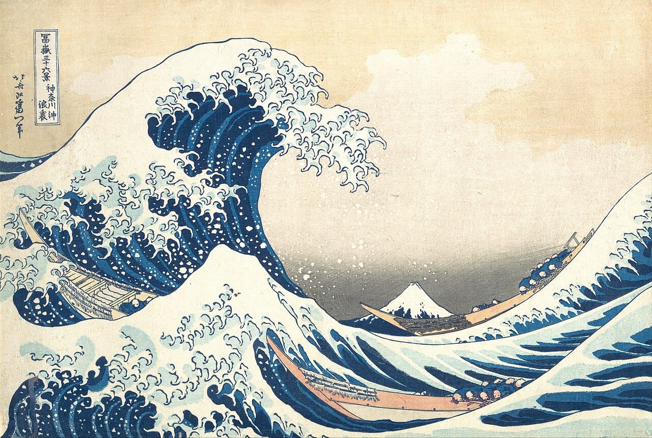
Reference Image: Hokusai’s “The Great Wave off Kanagawa”
The iconic woodblock print “The Great Wave off Kanagawa” (c. 1830-1832) exemplifies fukinsei through masterful asymmetrical composition. The massive, towering wave dominates the right portion of the composition, creating awe and dynamic energy. This powerful element is balanced by the diminutive Mount Fuji on the left, appearing almost insignificant yet providing essential visual and emotional grounding.
The composition demonstrates how contrasting visual weights—the intricate, complex wave texture versus the simple, triangular mountain shape—create equilibrium through asymmetry rather than symmetry. The cool blues of the wave contrast with warm oranges and pale yellows, further emphasizing the dynamic tension between elements.
Fukinsei in Design and Decorative Arts
Japanese Garden Design
Japanese gardens represent perhaps the most sophisticated applications of fukinsei in environmental design. These carefully composed landscapes appear natural and spontaneous while incorporating precise calculations of asymmetrical balance. Rocks, water features, plants, and pathways are positioned with apparent casualness that masks deliberate artistic intention.
In a traditional rock garden (karesansui), stones are typically arranged in odd numbers—three, five, or seven—rather than even numbers that would suggest symmetrical pairing. A large boulder positioned to one side might be counterbalanced by a cluster of smaller stones arranged at varying heights on the opposite side. This asymmetrical arrangement creates visual dynamism while maintaining overall harmony.
Pathways wind through gardens without following straight lines, reflecting the principle that natural beauty requires irregularity and unexpected turns. A simple bridge might lean slightly or cross a stream at an angle, creating visual interest through subtle asymmetry rather than geometric precision.
Ikebana: Asymmetrical Flower Arrangement
Ikebana, the Japanese art of flower arrangement, embodies fukinsei through intentional asymmetrical composition. Unlike Western floral design that often emphasizes dense, symmetrical arrangements, ikebana celebrates empty space and asymmetrical positioning of botanical elements.
In traditional ikebana styles, three primary points define the composition—shin (heaven), soe (man), and hikae (earth)—arranged asymmetrically to create dynamic triangular forms. Flowers and branches are positioned at varying heights and angles, leaving substantial empty space within the arrangement. This negative space is as important as the botanical elements themselves, reflecting the ma (negative space) principle central to Japanese aesthetics.
The “rule of thirds” often guides ikebana placement, with focal flowers positioned off-center at intersection points rather than in the middle. This arrangement creates visual tension and encourages the viewer’s eye to move through the composition rather than rest at a central point.
Japanese Ceramic Design
Traditional Japanese ceramics, particularly tea bowls used in chanoyu (tea ceremony), exemplify fukinsei through asymmetrical form and surface treatment. These handcrafted pieces celebrate imperfection as an essential aesthetic quality rather than a flaw to be corrected.
A tea bowl’s lip might be slightly irregular, one side thicker than the other. The glaze application creates unpredictable color variations and textures that develop during firing. These irregularities represent the artist’s hand and the natural processes inherent in ceramic creation. The asymmetry creates visual interest and invites tactile engagement—the irregular rim feels different as you hold and drink from the bowl.
This appreciation for asymmetrical form and surface variation fundamentally differs from Western ceramic traditions that emphasize precision and uniformity. In fukinsei aesthetics, the “imperfect” hand-thrown bowl possesses far greater beauty than an identical, machine-produced piece.
Fukinsei in Contemporary Graphic Design
Symmetrical Layout and Visual Hierarchy
Modern graphic designers increasingly employ fukinsei principles to create dynamic, engaging layouts that break from rigid symmetrical grids. Contemporary web design, poster design, and editorial layouts often feature prominent elements positioned off-center, balanced by secondary elements positioned at varying distances and sizes.
This asymmetrical approach creates visual tension and directs viewer attention more effectively than centered, symmetrical layouts. The eye doesn’t immediately rest at an obvious focal point but instead travels through the composition, discovering hierarchy and meaning through carefully considered element placement.
Design Context: asymmetrical graphic design, dynamic layout, visual hierarchy, modern design principles, off-center composition, Japanese design influence
Typography and Whitespace
Fukinsei principles manifest in contemporary typography through intentional use of whitespace and asymmetrical text placement. Instead of centering headlines or distributing text evenly across the page, designers position type asymmetrically to create visual interest and guide reading flow.
The principle recognizes that empty space (ma) functions as an active design element rather than an unused canvas. Strategic whitespace balances dense text blocks and creates breathing room that enhances readability while contributing to overall aesthetic sophistication.
Color and Texture Contrast
Contemporary designers employ fukinsei by balancing contrasting colors, textures, and visual weights across asymmetrical compositions. A bold color accent positioned in one area might be balanced by subtle texture variations elsewhere. This approach creates equilibrium through contrast rather than repetition, resulting in compositions that feel fresh and engaging rather than predictable or static.
The Psychology of Fukinsei: Why Asymmetry Engages
Invitation to Interpretation
Asymmetrical compositions inherently invite viewer participation and interpretation. When an artwork or design feels complete and symmetrical, the mind quickly processes and moves on. However, asymmetrical arrangements create cognitive tension—the viewer’s brain seeks to understand how balance is achieved, engaging more deeply with the composition.
This principle explains why slightly imperfect compositions often resonate more powerfully than technically flawless designs. The asymmetry captures attention, sparks curiosity, and creates memorable experiences that symmetrical arrangements cannot match.
Natural Alignment with Nature
Nature itself is fundamentally asymmetrical. Trees grow with branches extending unevenly. Rivers wind and curve rather than flowing straight. Animal forms rarely display perfect bilateral symmetry at close examination. By embracing asymmetry, fukinsei aligns aesthetic principles with the natural world, creating harmony between art and environment.
This philosophical alignment with nature reflects Zen Buddhism’s core principle of understanding reality as it actually exists rather than imposing artificial order. Fukinsei accepts and celebrates this natural asymmetry rather than attempting to “improve” it through artificial symmetrical organization.
Practical Applications: Implementing Fukinsei
In Painting and Drawing
When creating compositions, resist the urge to center focal points. Position your primary subject off-center, using the rule of thirds to guide placement. Balance larger elements with smaller, more delicate forms positioned at varying distances. Employ asymmetrical negative space to create depth and visual interest.
Practice incomplete compositions—leave areas unfinished or suggest rather than fully render certain elements. This restraint invites viewer imagination and aligns with fukinsei principles of imperfection and suggestion.
In Interior Design
Create asymmetrical room arrangements by positioning furniture, artwork, and decorative elements off-center. Balance a large sofa on one wall with a collection of smaller, varied pieces on the opposite wall. Use vertical elements of different heights to create dynamic interest without formal symmetry.
Embrace irregularity in material selection and arrangement. Combine textures, colors, and styles in asymmetrical compositions that feel intentional rather than chaotic.
In Graphic and Web Design
Design asymmetrical layouts that guide viewer attention through strategic element placement. Use varying font sizes, weights, and colors to establish hierarchy without centering elements. Employ whitespace asymmetrically to create visual flow and direct reading sequence.
Connecting Fukinsei to Related Aesthetic Principles
Fukinsei exists within a broader ecosystem of Japanese aesthetic principles: – Wabi-Sabi: The philosophical foundation celebrating imperfection, impermanence, and incompleteness – Kanso: Simplicity through purposeful elimination, working alongside fukinsei to avoid cluttered asymmetry – Ma: Negative space as an active design element, essential to asymmetrical balance – Yūgen: Subtle, mysterious grace not immediately visible but deeply felt
These principles often work in concert. Fukinsei provides the compositional structure through asymmetry, kanso ensures purposeful simplicity, and ma activates negative space as a design element. Together, they create compositions that feel authentic, engaging, and profoundly beautiful.
Conclusion: Embracing Beautiful Imperfection
Fukinsei teaches a profound philosophical lesson extending far beyond aesthetic principles: that beauty, balance, and meaning need not conform to rigid symmetry or perfection. This Japanese aesthetic principle invites us to celebrate irregularity, embrace imperfection, and find elegance in what is naturally flawed and incomplete.
By incorporating fukinsei into design work, artistic practice, and daily life, we align ourselves with natural principles and invite deeper engagement with our surroundings. The slightly off-center composition, the asymmetrically arranged garden, the handcrafted tea bowl with its irregular lip—each demonstrates that true beauty emerges from authentic, intentional asymmetry.
In our contemporary world, obsessed with precision, uniformity, and perfection, fukinsei offers a liberating alternative: the permission to celebrate imperfection, the power of asymmetry, and the profound beauty found in what is naturally, authentically, and deliberately unbalanced.
—
Keywords Summary – Fukinsei (Japanese aesthetic principle) – Asymmetrical balance in art – Japanese design principles – Wabi-sabi philosophy – Asymmetrical composition techniques – Japanese painting aesthetics – Dynamic asymmetry in design – Zen aesthetic principles – Japanese graphic design – Contemporary design asymmetry – Visual weight and balance – Natural imperfection in design – Intentional asymmetry
“Silhouetted by Fire” stands as a profound mixed-media composition that bridges historical trauma with contemporary suffering through powerful visual testimony. The painting features a central portrait rendered in halftone dot pattern technique, creating a newspaper-like photographic quality that immediately evokes themes of documentation and witness bearing. This stencil-inspired approach, reminiscent of street art and protest graphics, transforms the subject into both an individual story and a universal symbol of resistance.
The Concept & Inspiration
Halftone Textures: Creates a newspaper-style photographic quality, evoking themes of documentation and witness-bearing.
Dripping Paint Effects: Suggests the immediacy of trauma and the passage of time.
Gold & Silver Leaf: Represents both destructive flames and transformative illumination.
Silhouetted By Fire Painting By Borna Libertines 2024
Silhouetted By Fire Painting By Borna Libertines 2024
Silhouetted By Fire Painting By Borna Libertines 2024
Historical Context
This work creates a palimpsest where different eras of violence overlap. From Auschwitz (1940-1945) to Gaza (2025)—demanding recognition of recurring human cruelty.
A profound mixed-media composition bridging historical trauma with contemporary suffering. This piece serves as a visual testimony to resistance and the dangers of silence.
Artistic Techniques & Symbolism
The composition employs a dramatic red and orange background with cascading, dripping paint effects, creating an atmosphere of urgent destruction and flowing grief. These dripping techniques suggest both the immediacy of trauma and the passage of time, as paint flows like tears, blood, or the very fires that consumed countless lives. Silver and golden leaf elements are strategically integrated throughout the work, serving as powerful metaphorical representations of fire – both destructive flame and transformative illumination.
The bold textual element “If we become silent, it means they have won” commands attention, creating a rallying cry that transforms the artwork from memorial into manifesto. This phrase, combined with layered historical references spanning from Auschwitz 1940-1945 to Gaza 2025, creates a palimpsest effect where different eras of systematic violence overlap and intersect, demanding recognition of recurring patterns of human cruelty.
Understanding Purposeful Elimination in Painting and Design
Introduction
Kanso (簡素) is defined as “simplicity” or the elimination of clutter. According to Kanso Design, everything in the design must have a purpose—nothing is there for simple decoration. When followed, kanso is believed to help soothe anxiety and de-clutter the mind.
Kanso is a Japanese design philosophy rooted in Zen aesthetics that emphasizes achieving beauty through purposeful elimination rather than decoration. As one of the seven core aesthetic principles of wabi-sabi, kanso represents the belief that maximum effect can be achieved with minimum means, where every element must serve a genuine purpose or be removed.
The Philosophy of Kanso
The fundamental principle of kanso is that beauty and visual elegance are achieved through omission rather than addition.
This approach differs from mere minimalism—it’s a conscious process of elimination that reveals the essence of something by stripping away distractions. The goal is not to create emptiness, but to create space for presence, clarity, and awareness. By removing non-essential elements, kanso is believed to help soothe anxiety and de-clutter both the visual field and the mind.
Kanso in Traditional Japanese Painting
Sumi-e (Ink Painting)
In Japanese ink painting (sumi-e), kanso manifests through the profound simplicity of monochrome brush work. Traditional sumi-e artists express that “ink holds five colors,” referring to the richness achieved through variations in tone and intensity using only black ink. The art form captures the spirit of subjects with reduced, simplified brush strokes that convey everything from dynamic power to elegant tranquility.
Artists practice strict restraint, often creating complete compositions with just a few deliberate strokes—such as bamboo rendered in only three strokes.
The Role of Ma (Negative Space)
The concept of ma (negative space) works in tandem with kanso in painting traditions. Empty space becomes as important as the painted elements themselves, attracting attention to what is highlighted and creating balance through what is left unsaid. In botanical watercolors, for example, artists may choose to leave backgrounds unpainted, letting the white paper serve as a soothing space that emphasizes the essential subject without visual competition.
Shodo (Japanese Calligraphy)
Japanese calligraphy (shodo) embodies kanso through its emphasis on the quality and intention of each line. Calligraphers follow strict conventions regarding line thickness variation, character size, and ink distribution to achieve clarity and purposeful expression. The practice begins with kaisho (standard script) where each stroke is written separately with the brush lifted, creating clear, legible characters that eliminate decorative flourishes. This discipline trains practitioners to value precision and purpose over ornamentation, with each stroke carrying meaning and contributing to the whole composition.
Kanso in Contemporary Graphic Design
In contemporary graphic design, kanso manifests as a strategic elimination process that emphasizes functionality and clarity. Designers following this principle scrutinize every element, asking whether it serves a genuine purpose—if not, it should not exist. This approach has influenced successful design philosophies like Apple’s emphasis on clean, simple interfaces over feature-packed complexity.
Key Applications in Graphic Design
Asymmetrical Balance: Following the related principle of fukinsei, kanso-inspired designs often employ dynamic asymmetry rather than rigid symmetry, creating visual interest through irregular but balanced compositions.
White Space Utilization: Negative space becomes an active design element rather than a leftover area, similar to the concept of ma in traditional arts.
Typography and Layout: Simplified logos and uncluttered layouts allow essential messages to emerge with clarity, as seen in brands like Muji.
User Interface Design: Digital applications employ kanso by showing users only what is useful, creating better experiences through restraint and purposeful omission.
Applying Kanso to Painting Composition
Embrace Negative Space (Ma)
The most fundamental technique is treating unpainted areas as active compositional elements rather than empty voids. In sumi-e painting, white space—known as ma—is as integral to the composition as the painted elements themselves. By deliberately leaving areas blank, you create balance and allow the viewer’s mind to complete the image, fostering deeper engagement with the work. The unpainted areas should be as carefully considered as your brush strokes, attracting attention to what is highlighted while providing visual rest.
Suggestion Over Representation
Rather than explicitly detailing every element of your subject, focus on suggestion and implication. Traditional Japanese paintings emphasize what is left unsaid, inviting viewers to fill gaps with their imagination. This approach creates a powerful sense of ma and allows the artwork to resonate on a deeper level. For example, instead of painting a complete landscape with every tree and rock defined, render only the essential elements that convey the spirit of the scene—a few brush strokes for bamboo, suggestive marks for distant mountains, leaving the rest to imagination.
Asymmetry and Visual Balance
Kanso compositions favor asymmetrical arrangements over rigid symmetry. Rather than centering your subject or creating mirror-image balance, position elements off-center to create dynamic tension while maintaining overall harmony. This asymmetry reflects natural patterns and feels more organic than forced symmetrical arrangements. The concept of fukinsei (asymmetrical balance) works in tandem with kanso—elements are distributed unevenly but still feel balanced through careful consideration of visual weight and negative space.
Eliminate Non-Essential Elements
Practice strict restraint by questioning every element you consider adding to your composition. If a brush stroke, detail, or object doesn’t serve a genuine purpose in conveying your subject’s essence, leave it out. In sumi-e tradition, artists often capture complete subjects with just a few deliberate strokes—bamboo rendered in three strokes, birds suggested with minimal marks. This discipline forces you to identify what is truly essential and discard everything else.
Control Brush Strokes and Marks
Each mark you make should be intentional and carry meaning. Practice controlling pressure and speed to achieve different effects with minimal strokes. In kanso-inspired composition, quality and intention matter more than quantity—one perfectly placed stroke can convey more than dozens of indecisive marks. Allow brush strokes to capture the spirit or energy of your subject rather than photographically reproducing its appearance.
Create Depth Through Simplicity
Use minimal elements to suggest spatial depth rather than rendering every detail in perspective. Overlapping simple shapes, subtle gradations in ink tone, and strategic placement of elements can convey distance without cluttering the composition. The principle is that atmosphere and space can be felt through what is absent as much as what is present.
Master Works to Study
Hasegawa Tōhaku’s “Pine Trees” (c. 1595)
Hasegawa Tohaku Pine Trees Shorin Zu Byobu
This six-panel folding screen depicts pine trees emerging from mist using only black ink on an empty background. Tōhaku created an entire misty forest landscape with just a few bold, rough brush strokes, expressing a quiet Zen world through minimal marks. The work demonstrates how negative space—the unpainted areas—creates depth, atmosphere, and the sensation of morning light and haze without any explicit rendering. Despite being considered unfinished, this National Treasure remains one of Japan’s most celebrated paintings for its masterful use of suggestion over representation.
His “Winter Landscape” (c. 1470s) and “Four Landscape Scrolls of the Seasons” use emphatic outlines, angular brushstrokes, and flattened space to portray Zen beliefs. Sesshū, considered one of the greatest sumi-e masters, traveled extensively through China before developing a free-flowing brush style that had a profound influence on Japanese painting. His works demonstrate how to capture entire landscapes with minimal elements while conveying both the physical form and spiritual essence of nature.
Traditional “Four Noble Plants” Compositions
Bamboo, orchid, chrysanthemum, and plum blossom were painted with symbolic meaning, each requiring mastery of suggestion—bamboo often rendered in just three strokes, orchids with minimal marks that convey both form and movement. These subjects teach restraint and the principle that fewer, more intentional marks communicate more effectively than detailed rendering.
Contemporary Artists
Rei Naito represents contemporary kanso principles through installations that work with light, space, and “presence through absence.” Her art focuses on what is typically overlooked—breath, dust, traces of human presence—creating environments where viewers experience the power of emptiness.
Nihonga painting tradition continues to embody kanso in contemporary practice. This late 19th-century style creates paintings where silence takes on substance and light becomes the material of form itself. Nihonga artists express meaning through what remains unsaid, maintaining a palpable affinity with Zen philosophy while using traditional materials and compositional approaches.
Lee Ufan (Mono-ha movement) applies minimalist principles rooted in Japanese aesthetics to contemporary art. His work emphasizes the relationship between materials and space, demonstrating how kanso principles translate into modern contexts where restraint and purposeful emptiness create powerful visual experiences.
Conclusion
The practice of kanso encourages thinking in terms of clarity rather than decoration. In both traditional and contemporary applications, this means asking what is essential and removing everything else. The result is what practitioners call “quiet elegance”—nothing extra, nothing forced, but maximum impact through intentional simplicity. This aesthetic creates compositions that feel clear, purposeful, and honest, allowing the true nature of the subject to be felt more deeply without distraction.
When examining kanso-inspired compositions, observe how artists create depth and atmosphere through unpainted areas rather than detailed rendering. Notice the ratio of painted marks to empty space—often the negative space occupies significantly more surface area than the brush strokes. Study how asymmetrical placement of minimal elements creates dynamic balance, and how suggestion invites viewer participation to complete the image mentally. Pay particular attention to how these artists convey light, atmosphere, and spatial depth using only variations in ink tone and strategic placement of marks.
By practicing kanso principles, you develop not just technical skills, but a philosophical approach to art-making that values intention, restraint, and the profound beauty of what is left unsaid.
Mastering Kanso, Fukinsei, Shibui, Shizen, Yugen, Detsuzoku, and Seijaku: A Comprehensive Exploration of Zen Aesthetic Philosophy
Published: January 8, 2026 | Design Philosophy Archive | Language: English
Hasegawa Tohaku Pine Trees Shorin Zu Byobu Japanese Design Principles
Understanding Japanese Design Philosophy
Japanese design principles represent a profound aesthetic philosophy rooted in Zen Buddhism and centuries of cultural refinement. These seven foundational principles—Kanso (simplicity), Fukinsei (asymmetry), Shibui (subtle beauty), Shizen (naturalness), Yugen (profound grace), Detsuzoku (freedom from convention), and Seijaku (stillness)—guide designers, artists, and thinkers worldwide.
Unlike Western design traditions that often emphasize decoration and ornamentation, Japanese design prioritizes simplicity, impermanence, and harmony with nature. These principles derive from Buddhist teachings on the transience of existence and Zen meditation practices that cultivate inner awareness and spiritual clarity.
This comprehensive guide explores each principle in depth, examining their philosophical origins, practical applications in contemporary design, and their manifestations in traditional Japanese art forms—from the minimalist tea ceremony to the contemplative beauty of landscape painting.
Featured Keywords: Japanese design principles Zen aesthetics, minimalist design, Wabi-Sabi philosophy , Japanese interior design, contemporary design inspiration
Simplicity, elimination of clutter, clarity through omission
Philosophical Foundation
Kanso is the principle of simplicity and the conscious elimination of unnecessary elements. In Zen philosophy, kanso represents the idea that beauty emerges not through addition, but through strategic subtraction. By removing what is non-essential, the truly important elements gain prominence and clarity.
Core Characteristics
Elimination of Clutter: The removal of decorative excess and superfluous objects
Emphasis on Function: Beauty exists in the optimal performance of form and purpose
Clarity Through Omission: What is left unsaid often carries more weight than elaborate explanation
Quiet Elegance: Understated sophistication without ostentation or display
Spatial Breathing: White space and silence are treated as vital design elements
Design Applications
Interior Design & Architecture
Traditional Japanese homes embody kanso through sparse furnishings, minimal color palettes, and open floor plans. Each element serves a purpose; nothing is decorative for decoration’s sake. The result is a serene environment where the eye finds rest and the mind achieves clarity.
Graphic Design & Typography
In contemporary graphic design, kanso manifests as generous white space, restrained color usage, and deliberate typography choices. Apple’s minimalist product design exemplifies this principle—clean lines, essential features only, and an almost austere beauty.
Visual Art
In landscape painting (sumi-e), kanso appears as unpainted negative space suggesting depth and atmosphere. A few brushstrokes describing a mountain, mist rendered as empty paper—the artist’s restraint invites viewer participation and contemplation.
Keywords for Kanso: minimalist design simplicity principle Japanese minimalism clutter-free design simplistic elegance design by subtraction Zen simplicity
Related Concepts: Kanso connects directly to the broader Wabi-Sabi aesthetic, which celebrates imperfection and impermanence. It also relates to Ma (negative space) and the principle of Shizen (naturalness), as natural environments rarely contain unnecessary elements.
Fukinsei embraces asymmetry and irregularity as paths to dynamic beauty. Rejecting the Western preference for symmetrical perfection, fukinsei celebrates the inherent imbalance found in nature. A tree grows at an angle; flower petals fall unevenly; mountains rise at varied heights. This principle asserts that true beauty emerges from this asymmetrical balance.
Core Characteristics
Asymmetrical Composition: Dynamic visual balance achieved through imbalance
Natural Irregularity: Reflecting the patterns of nature, which rarely create perfect symmetry
Movement & Energy: Asymmetry suggests motion, growth, and vitality
Visual Interest: Irregular compositions maintain viewer engagement without monotony
Imperfection as Authenticity: Flaws signal genuine creation rather than mechanical reproduction
Design Applications
Japanese Garden Design
Traditional Japanese gardens avoid bilateral symmetry. Pathways curve unpredictably; stone lanterns (ishidoro) are placed at non-obvious angles; water features flow organically rather than geometrically. This creates an environment that mimics natural landscapes, inviting exploration and discovery.
Ikebana (Flower Arrangement)
The three primary elements of ikebana—shin (heaven), soe (earth), and hikae (humankind)—are positioned at different heights and angles, creating dynamic asymmetrical compositions. This design method transforms flower arrangement into a meditation on natural growth patterns and spatial relationships.
Contemporary Graphic Design
Modern designers use fukinsei to create engaging layouts where visual weight is distributed through asymmetrical placement rather than centered composition. Image placement, typography positioning, and element sizing follow this principle to generate dynamic, visually compelling designs.
Keywords for Fukinsei: asymmetric design asymmetrical balance dynamic composition Japanese garden design irregular layout natural asymmetry creative balance
Related Concepts: Fukinsei opposes Western symmetrical ideals and represents liberation from rigid geometric perfection. It aligns with Zen Buddhism’s acceptance of imperfection and supports the principle of Shizen (naturalness) by mimicking organic growth patterns.
Shibui (the adjective form) and shibumi (the noun form) describe a particular aesthetic refined through restraint. Rather than obvious beauty—bright colors, ornate decoration, eye-catching design—shibui finds elegance in subtlety. It suggests sophistication achieved through understatement and the refinement of form over flashiness.
Core Characteristics
Subtle Depth: Beauty that reveals itself gradually upon close observation
Understated Elegance: Avoiding ostentation and flashiness in favor of quiet refinement
Sophistication Without Display: “Old money” elegance that doesn’t announce itself
Muted Color Palettes: Earth tones, grays, indigos, and natural hues
Complexity in Simplicity: Items that appear simple yet contain profound depth upon examination
Design Applications
Traditional Japanese Textiles
The finest Japanese kimonos exemplify shibui. Woven from natural fibers in muted earth and indigo tones, these garments feature subtle patterning that reveals itself through close inspection. A grey silk might contain barely-visible darker grey motifs that emerge in different light—this is shibumi in textile form.
Ceramic Arts & Tea Ceremony
The tea bowls (chawan) used in the Japanese tea ceremony often appear plain at first glance. Yet through handling and use, their texture, glaze variations, and form create a contemplative beauty. Master potter Shoji Hamada’s work exemplifies this principle—functional vessels of stunning restraint.
Contemporary Fashion & Luxury Design
High-end contemporary design embraces shibui through neutral color palettes, quality over quantity, and timeless silhouettes. Luxury brands emphasizing minimalist aesthetics—understated logos, perfect proportions, exceptional materials—embody this principle in modern luxury.
Keywords for Shibui: subtle beauty understated elegance refined design Japanese aesthetics sophisticated simplicity quiet luxury timeless design
Related Concepts: Shibumi represents a mature aesthetic perspective that rejects youth and newness. It connects to Wabi-Sabi through its celebration of age and patina, and to Yugen through its suggestion of depth beyond what is immediately visible.
Shizen 自然
SHIZEN Naturalness
Design focuses on the absence of artificiality.
Philosophical Foundation
Shizen literally means “nature,” but in design philosophy, it refers to the absence of artificiality and pretense. Paradoxically, achieving true shizen requires deliberate intention—a natural-looking garden is meticulously designed, while a spontaneous-appearing artwork represents years of disciplined practice. Shizen is nature perfected through human artistry, not raw nature.
Core Characteristics
Authentic Materials: Using natural substances that celebrate their inherent qualities
Unforced Appearance: Design that appears effortless despite careful planning
Harmony with Environment: Integration with surrounding natural systems
Organic Forms: Flowing lines and shapes inspired by nature’s patterns
Seasonal Awareness: Responding to and reflecting natural cycles and changes
Design Applications
Japanese Architecture
Traditional Japanese homes blur boundaries between interior and exterior. Sliding shoji screens allow seamless transition; large windows frame views of gardens; natural light changes define the passage of time. Materials—raw wood, stone, natural thatch—retain their authentic appearance, patinating and changing with age.
Landscape and Garden Design
Japanese gardens recreate idealized natural landscapes within bounded space. Water features flow naturally despite engineered courses; plant selections reflect local ecosystems; stone placement suggests geological processes. These gardens appear as found nature, yet every element serves deliberate aesthetic and philosophical purposes.
Contemporary Interior Design
Modern shizen design incorporates natural materials—wood, stone, natural fibers—in their most authentic forms. Rather than painted or treated surfaces, designers celebrate wood grain, stone texture, and material patina. This approach creates spaces that feel connected to natural cycles and organic growth.
Keywords for Shizen: natural design eco-friendly design sustainable architecture organic forms authentic materials nature-inspired design biophilic design
Related Concepts: Shizen fundamentally connects to ecological awareness and contemporary sustainability movements. It supports Kanso (simplicity) by avoiding artificial additives, and relates to Seijaku through nature’s inherent tranquility.
Yugen 幽玄
YUGEN Profound Grace
Profound grace, subtle profundity, suggestion over revelation, mystery and depth
Philosophical Foundation
Yugen represents the aesthetic of suggestion and mystery—the beauty that lies just beyond perception. Rather than revealing everything explicitly, yugen invites viewers to complete the experience through imagination. It emerges from Buddhist philosophy emphasizing the unknowable nature of existence and the contemplative power of partial understanding.
Core Characteristics
Suggestion Over Revelation: Showing less to imply more; incompleteness as artistic strategy
Atmospheric Depth: Creating mood and ambience through subtle visual and emotional cues
Viewer Participation: Engaging imagination and personal interpretation
Poetic Resonance: Beauty that transcends literal meaning to touch deeper awareness
Ineffable Quality: Excellence that exceeds technical description or rational analysis
Design Applications
Traditional Ink Painting (Sumi-e)
In sumi-e painting, vast landscapes are suggested through minimal brushwork. Mist and fog are represented as unpainted paper; distant mountains appear as faint grey washes; viewers imaginatively complete the scene. This technique embodies yugen—suggesting the infinite through the sparse and incomplete.
Japanese Poetry and Haiku
The seventeen syllables of haiku never explain or elaborate. Instead, they gesture toward profound truths about nature, seasons, and existence. Readers generate their own complete understanding from these minimal words, creating personal resonance and profound depth.
Contemporary Product & UX Design
In modern design, yugen appears as atmospheric lighting that suggests rather than illuminates, negative space that creates intrigue, and interface design that guides without explicit instruction. The most elegant products often feel intuitive through their restraint and suggestion of deeper functionality.
Keywords for Yugen: mystery design subtle depth atmospheric design minimalist painting contemplative art poetic design implicit meaning
Related Concepts: Yugen deeply influences all Japanese artistic expression and connects to the concept of Ma (negative space). It represents the ultimate expression of Shibui—beauty so profound it transcends clear articulation—and embodies Buddhist concepts of impermanence and the ineffable nature of existence.
Detsuzoku / Datsuzoku 脱俗
DATSUZOKU Freedom
Freedom from convention, liberation from routine, escape from the ordinary, creative non-conformity
Philosophical Foundation
Datsuzoku translates as “freedom from convention” or “escape from the ordinary.” It represents liberation from worldly attachments, social expectations, and habitual patterns of thought. This principle encourages breaking beyond comfortable routine to explore new dimensions of creativity and experience—not through rebellion, but through conscious transcendence.
Core Characteristics
Convention-Breaking: Deliberately stepping outside established patterns and expectations
Creative Innovation: Exploring unprecedented combinations and approaches
Mindful Exploration: Cultivating presence and curiosity in unfamiliar situations
Authentic Self-Expression: Choosing personal truth over social conformity
Spiritual Liberation: Transcending ego and material attachments through artistic practice
Design Applications
Zen Tea Ceremony Innovation
Zen master Sen Rikyū revolutionized the tea ceremony through datsuzoku. Rather than following aristocratic conventions of elaborate gold and ornate objects, he deliberately chose humble, rough pottery and austere spaces. His non-conformity created an entirely new aesthetic tradition.
Experimental and Contemporary Art
Datsuzoku manifests in contemporary art through rule-breaking and unconventional materials. Artists who deliberately challenge medium conventions, combine traditional and contemporary techniques, or explore taboo subjects embody this principle’s spirit of liberation from routine artistic expression.
Innovative Design and Architecture
Progressive architects use datsuzoku principles to break architectural norms—designing buildings that challenge spatial conventions, refusing historical styles, or creating structures that seem to defy traditional aesthetic rules. These works inspire new ways of experiencing and imagining built environments.
Keywords for Datsuzoku: creative freedom unconventional design innovative thinking rule-breaking art artistic liberation non-conformity boundary-breaking design
Related Concepts: Datsuzoku represents the liberation aspect of Zen Buddhism and directly supports creative evolution. It contrasts with the order of more structured principles while complementing their depth—true creativity combines the freedom of datsuzoku with the refinement of shibui and yugen.
Seijaku embodies the principle of stillness and silence—the creative power found in emptiness and quietude. Rooted in Zen meditation, seijaku suggests that profound energy and insight emerge from states of peaceful receptivity. Silence is not absence but presence; emptiness is fullness of potential.
Core Characteristics
Peaceful Silence: Treating silence and quietness as essential design elements
Contemplative Space: Creating environments that support deep reflection and meditation
Emptiness as Presence: Understanding void as fundamental creative potential
Stillness in Motion: Finding calm even within dynamic processes
Spiritual Receptivity: Cultivating mental clarity through deliberate quietude
Design Applications
Zen Temples and Meditation Spaces
Zen temples embody seijaku through sparse decoration, natural acoustics that amplify silence, and spatial arrangements that minimize distraction. These environments facilitate the meditative states that Zen Buddhism cultivates. Every element serves to deepen quietude and inner focus.
Music and Compositional Silence
In Japanese and Zen-influenced music, the pauses between notes carry equal importance to the notes themselves. Silence is compositional—not absence but active element. This principle demonstrates that stillness provides the foundation upon which all dynamic experience rests.
Contemporary Mindful Design
Modern wellness design incorporates seijaku principles through sound-dampening materials, minimal visual stimulation, carefully managed lighting, and spatial arrangements that reduce sensory overload. These spaces provide refuge from constant stimulation and support mental clarity and contemplation.
Related Concepts: Seijaku represents the ultimate expression of inner peace through external design. It connects to all other principles by providing the contemplative space in which their deeper meanings are realized. Seijaku is where action pauses and true understanding emerges.
Kanso (simplicity) Removes excess to reveal essence
Fukinsei (asymmetry) Creates dynamic balance through irregularity
Shibui (subtle beauty) Achieves sophistication through restraint
Shizen (naturalness) Integrates authentic materials and organic forms
Yugen (profound grace) Invites completion through suggestion and mystery
Datsuzoku (freedom) Liberates from convention through creative courage
Seijaku (stillness) Channels creative power through peaceful emptiness
Integration: How These Principles Work Together
These seven principles function as an integrated system rather than isolated concepts. Kanso provides the structural foundation by eliminating unnecessary elements. Fukinsei then enlivens these simplified forms through asymmetrical composition. Shibui refines the result into subtle sophistication, while Shizen ensures that the final design maintains an authentic connection to natural sources.
Yugen transforms the complete work into something transcendent by layering mystery and suggestion into its apparent simplicity. Datsuzoku ensures the design breaks free from tired conventions, and finally, Seijaku provides the contemplative space within which all other principles find their highest expression.
When all seven principles work in harmony, they create designs and artworks of remarkable depth, beauty, and lasting resonance—works that age gracefully, reveal new meanings with repeated exposure, and touch viewers at both intellectual and spiritual levels.
Embracing Japanese Design Principles in Your Practice
Japanese design principles offer profound guidance for contemporary creators, whether you work in graphic design, architecture, product development, or any creative field. These aren’t rigid rules but living philosophies that encourage deeper relationship with materials, space, and human experience.
By incorporating these principles—simplicity (Kanso), asymmetry (Fukinsei), subtle beauty (Shibui), naturalness (Shizen), profound grace (Yugen), creative freedom (Datsuzoku), and stillness (Seijaku)—you create work that transcends trends and touches something timeless within human consciousness.
The most powerful aspect of these principles is their universality. Though rooted in Japanese culture, they express fundamental truths about human perception, beauty, and the relationship between creator and audience. Mastering them means developing a design philosophy that resonates across cultures and generations.
References: Zen Buddhism Philosophy, Japanese Aesthetics Studies, Contemporary Design Theory
Keywords: Japanese design principles, Kanso, Fukinsei, Shibui, Shizen, Yugen, Datsuzoku, Seijaku, Zen aesthetics, Japanese philosophy
Shizen: The Japanese Design Principle of Intentional Naturalness
Published January 20, 2026
by Borna Libertines
Design Philosophy Shizen
In the lexicon of Japanese design principles, Shizen (自然)—meaning “naturalness” or “absence of artifice”—represents one of the most misunderstood yet profoundly influential concepts in global aesthetics. Unlike Western interpretations that conflate naturalness with untamed wilderness, Shizen embodies intentional simplicity achieved through disciplined creative purpose. This ancient principle, rooted in Zen Buddhism and Shinto philosophy, has become the philosophical backbone of contemporary design across architecture, interior spaces, industrial products, and digital experiences.
What Is Shizen? The Philosophy of Unforced Intent
Shizen transcends mere simplicity. It represents the principle of “purposeful” naturalness—where design solutions feel inevitable rather than imposed. In Zen aesthetics, Shizen operates within a system of seven interconnected principles known as Shibumi or Zen aesthetics. These principles work as a holistic network, each reinforcing the others:
Principle
Meaning
Modern Application
Kanso (簡素)
Simplicity and elimination of clutter
Removes non-essentials to reveal core function
Shizen (自然)
Naturalness and absence of artifice
Design feels effortless and authentic
Yūgen (幽玄)
Subtlety and profound mystery
Suggests rather than explains
Fukinsei (不均整)
Asymmetry and irregularity
Disrupts sterility to invite engagement
What distinguishes Shizen is its paradox: true naturalness requires tremendous intentionality. When Sen no Rikyū, the legendary 16th-century tea master, revolutionized the tea ceremony by introducing humble materials—bamboo, washi paper, unrefined wood—he was not abandoning craft. Instead, he was engaging in the highest form of creative discipline, identifying which elements are truly essential and which are mere ornamentation.
Shizen in Architecture: Where Buildings Dissolve Into Landscape
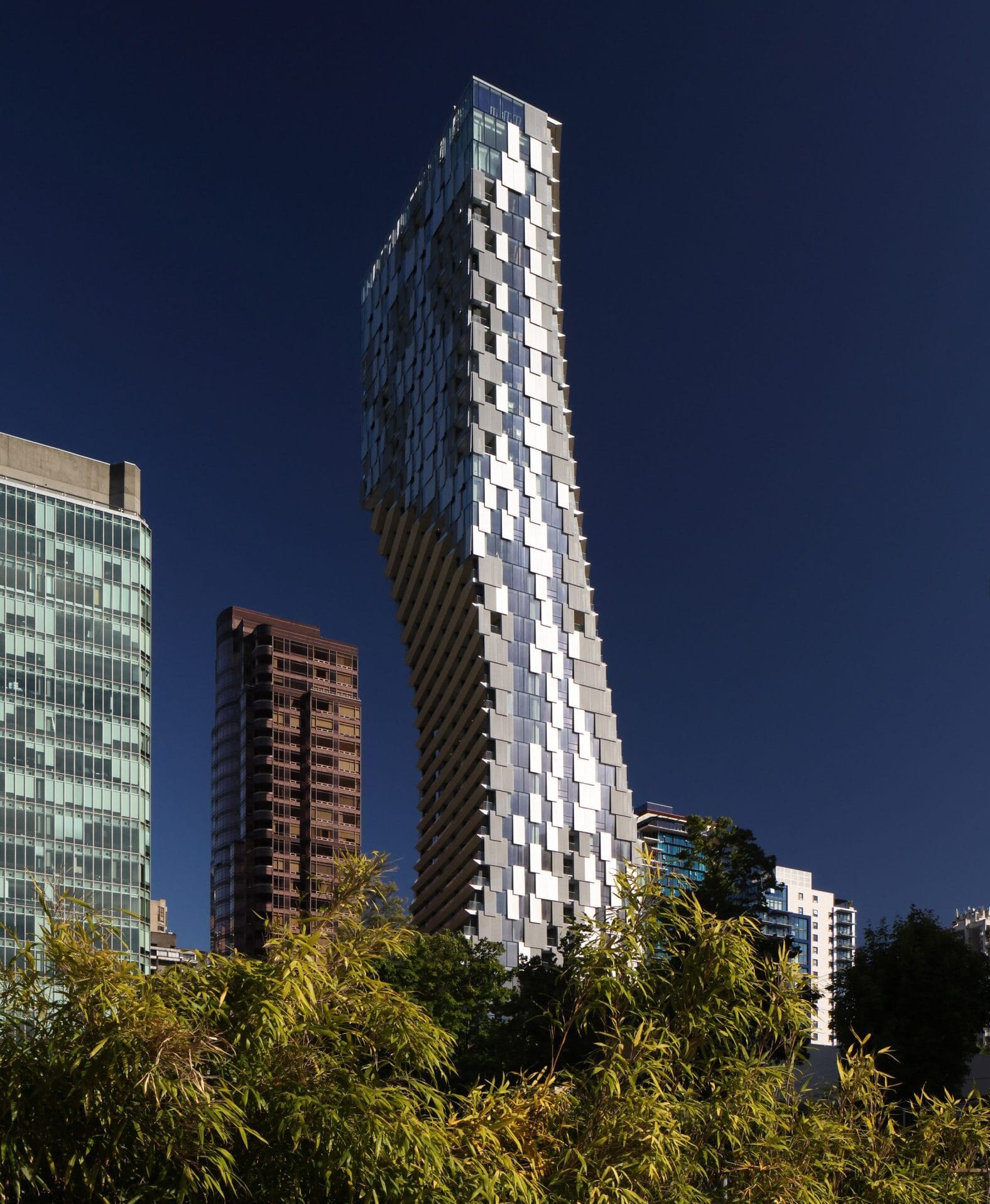
Contemporary Japanese architects have elevated Shizen from philosophy to built practice. Kengo Kuma, perhaps the world’s most articulate practitioner of Shizen-based architecture, designs buildings that seem to disappear into their natural surroundings. His Japan National Stadium accomplishes this through careful material selection—local cedar eaves, volcanic stone rubble that references the site’s geological history, and strategic tree preservation that integrates the Jingu Shrine’s ecosystem into the building itself.
Kengo Kuma Vancouver Skyscraper Alberni
In contrast, Tadao Ando employs Shizen through a different lens: the spiritual void created by unadorned concrete. His Water Temple and Church on the Water demonstrate that Shizen is not about prettiness; it’s about authenticity. By using stark, cast-in-place concrete without surface decoration, Ando directs all attention toward the essential subject matter—the interplay of light, shadow, and the surrounding landscape.
Both architects share a commitment to “porousness”—allowing air, light, and nature to flow through the structure. This reflects Shizen’s core belief that human design should not dominate nature but harmonize with it.
Shizen in Interior Design: Restorative Spaces and Sensory Narrative
The application of Shizen principles in interior spaces has evolved into a sophisticated approach to mental restoration and sensory design. Research in environmental psychology validates what Zen practitioners have known for centuries: minimalist spaces with natural materials reduce cortisol levels by 18–25%, effectively managing stress in hyperconnected urban environments.
The Shizen House project in Ahmedabad exemplifies this approach through:
Material Authenticity: Raw stone, natural wood, and lime-washed walls create tactile variety without visual clutter.
Textural Dialogue: Deliberately varied surfaces—rough and smooth—encourage physical interaction with the space.
Temporal Lighting: Soft, diffused illumination that shifts organically throughout the day, transforming the perception of materials.
This sensory narrative aligns with Attention Restoration Theory (ART), which proposes that biophilic elements and spatial clarity catalyze cognitive rejuvenation. Shizen interiors function as psychological sanctuaries—spaces that allow the mind to recover from digital saturation and information overload.
Shizen in Industrial Design: The “Super Normal” Revolution
Naoto Fukasawa, the industrial designer behind MUJI’s minimalist aesthetic, has systematized Shizen into what he calls “Super Normal”—the principle of designing objects that feel so inevitable they become invisible. His design philosophy, “Without Thought,” taps into pre-existing human behaviors and instinctive knowledge.
Consider MUJI’s CD player: rather than inventing a novel interface, Fukasawa observed that users already understood the motion of pulling a string (from kitchen ventilation systems). By translating this intuitive gesture into the product interface, he created a design that required no manual explanation. The object simply felt right.
Wall Mounted Cd Player By Naoto Fukasawa For Muji
Fukasawa compares his design process to making soup—using minimal seasoning to highlight the essential flavors. This “satisfying modesty” prevents the over-design that characterizes much commercial products. The goal is not originality but timelessness—objects people “fall in love with again naturally” after periods of boredom.
Shizen Design Principles in Product Development:
Identify the Archetype: What form would this object naturally take if left to its own logic?
Eliminate Artifice: Remove design flourishes that serve ego rather than function.
Embrace Material Integrity: Allow materials to express their authentic nature.
Optimize for Intuition: Users should intuitively understand how to interact with the design.
Shizen in Contemporary Art: From Mono-ha to Modern Practice
The late-1960s Mono-ha movement, led by artist Lee Ufan, redefined contemporary sculpture through Shizen principles. Rather than expressing subjective emotion through materials, Mono-ha practitioners engaged in “quiet confrontation”—juxtaposing raw stones and industrial iron plates to reveal the inherent beauty of materials themselves.
Lee’s artistic practice embodies what he calls Chutohampa—an “incomplete” or “unpolished” aesthetic where imperfection invites viewer participation. In his From Point and From Line painting series, Lee documents the temporal process of mark-making: using a single brush stroke until pigment is exhausted, creating a visual record of “doing and non-doing.” This represents a radical departure from Western action painting’s ego-driven expression, prioritizing instead the “as-is” state of material over artistic will.
Shizen and Sustainability: The Ethical Imperative
As global society confronts ecological crisis, Shizen transitions from aesthetic preference to ethical necessity. The Zen concept of mottainai—”cherishing objects” and lamenting waste—resonates with contemporary circular economy principles.
Kintsugi, the practice of repairing broken pottery with gold lacquer, transforms defects into marks of historical beauty while extending product lifecycles. This philosophy embodies Shizen’s belief that impermanence and imperfection are features, not flaws. By designing for repair, material recovery, and biodegradability, contemporary designers honor both Zen principles and ecological responsibility.
Implementing Shizen in Your Creative Practice
Whether you’re designing a product, interior space, or brand experience, Shizen offers a practical framework for creating work that feels authentic and timeless:
Strip Away Non-Essentials: Question every element. Does it serve function or ego?
Respect Material Logic: Allow materials to express their authentic nature rather than imposing artificial finishes.
Embrace Asymmetry: Perfect symmetry signals artifice. Natural systems are beautifully irregular.
Create Space for Interpretation: Suggest rather than explain. Allow viewers/users to complete the experience.
Prioritize Longevity: Design for timelessness, not trends. Objects should “feel inevitable” rather than fashionable.
Conclusion: The Enduring Power of Shizen
Shizen represents a fundamental reorientation of creative values—from novelty to authenticity, from impression to essence, from designed appearance to discovered truth. In an era of sensory saturation and algorithmic manipulation, Shizen’s emphasis on “unforced intent” and “restorative naturalness” offers both aesthetic direction and philosophical grounding.
The principle’s global resonance suggests that beneath cultural differences, humans universally recognize and respond to authenticity. When a design feels inevitable rather than imposed, when materials express their true nature, when spaces invite restoration rather than stimulation—that is when we encounter Shizen.
This ancient Japanese principle has become a contemporary necessity: a reminder that true innovation lies not in doing more, but in discovering what was always essential.
Streetwear as Your Canvas: Expressing Identity Through Apparel
Forget everything you know about streetwear as just another fashion trend. Your clothes are shouting your story — raw, bold, and unfiltered. Borna Libertines turns urban fashion into wearable art that speaks your truth through mixed media and graffiti, making every piece a unique canvas for self-expression. Ready to wear your identity loud and proud?
The Art of Streetwear
Urban fashion doesn’t just follow trends; it sets them. It’s about making statements that resonate beyond the fabric. Let’s explore how streetwear becomes a canvas for your story.
Exploring Urban Fashion
Urban fashion is all about expressing who you are. It’s like wearing your personality for the world to see. This style isn’t just about clothes; it’s a movement that embraces change and culture. Imagine stepping into a world where your hoodie isn’t just warm—it’s a statement of your beliefs.
Statement Tees: More than just fabric, these tell your story.
Hoodies with a Twist: Combining comfort with bold messages.
Accessories with Attitude: Adding flair to your everyday look.
Most people think streetwear is just for casual days, but it’s so much more. It’s about connecting with a larger culture. Dive deeper into the essence of streetwear and discover how it’s reshaping fashion.
Graffiti as Wearable Art
Graffiti isn’t just for walls anymore. It’s found a new home on the clothes you wear. This art form brings a burst of creativity to streetwear, making each piece a conversation starter. Picture your jacket as a canvas showcasing street stories and vibrant colors.
Bright Colors: Bringing life to everyday attire.
Storytelling Through Art: Every piece has a narrative.
Unique Designs: No two pieces are the same.
Your apparel becomes an extension of who you are. Wearable art challenges the ordinary, inviting you to stand out. The longer you wait to embrace this, the more you’ll miss out on defining your identity through fashion.
Self-Expression Through Unique Apparel
Streetwear offers a unique way to express yourself. It’s like wearing your beliefs and values. Let’s look at how mixed-media designs and cultural critique turn your wardrobe into a personal gallery.
Mixed-Media Collage in Fashion
Mixed media in fashion is like a puzzle of creativity. It’s about blending different elements to create something new. Think of your shirt as a piece of art, combining textures and visuals in unexpected ways.
Textures that Talk: Feel the difference in every thread.
Visual Mash-ups: Bringing together diverse influences.
Art Meets Apparel: Wearing creativity on your sleeve.
This approach to fashion lets you express complex ideas simply. Just as the artist mixes media, you mix style with meaning. Be a part of this blend and explore streetwear as self-expression.
Cultural Critique with Style
Fashion becomes powerful when it critiques culture with style. Your clothes can speak volumes. Through bold designs, they challenge societal norms and provoke thought. Imagine a jacket that raises questions and sparks dialogue.
Bold Messages: Clothes that make you think.
Societal Commentary: Addressing issues with style.
Artistic Dialogue: Creating conversation through design.
Most people see clothes as mere coverings, but yours can be so much more. They can be a platform for stories that matter. Why settle for the ordinary when your attire can challenge conventional views?
Join the Borna Libertines Community
Being part of a community means sharing values and visions. Borna Libertines invites you to showcase your individuality with flair. Discover their latest offerings and how you can become part of this creative movement.
Showcasing Individuality Boldly
Expressing individuality through fashion is empowering. It’s about being unapologetically you. Borna Libertines helps you stand out with pieces that reflect your unique style. Imagine a wardrobe full of bold statements and vibrant designs.
Personal Style: Clothes that reflect your inner voice.
Confidence in Every Stitch: Wearing your identity proudly.
Stand Out: Why blend in when you can stand out?
Fashion is more than just clothes; it’s about self-expression. Join a community that values creativity and individuality. Discover the rise of individual expression in modern streetwear.
New Arrivals and Limited Editions
New arrivals bring fresh opportunities to express yourself. Borna Libertines offers limited editions that are as unique as you are. Each piece is designed with care, turning everyday fashion into art.
Limited Editions: Unique pieces that won’t be repeated.
Latest Trends: Staying ahead in the fashion game.
Artistic Flair: Adding a touch of creativity to your closet.
Don’t miss the chance to redefine your style. Explore new arrivals and be among the first to wear these exclusive designs. The longer you wait, the more you’ll miss out on pieces that truly speak to you.
🖌️👕🎨
By embracing streetwear as a canvas, you wear your identity and beliefs. Through art-infused apparel, you become part of a larger narrative. Are you ready to transform your wardrobe into a gallery of self-expression?
A story like this finds its home among Borna Libertines readers – where brushstrokes meet hoodies, where pixels shape taste. This script opens a door, not a whole room, just enough light to see Murakami’s roots in alleyways and glitch screens. A beginning hides inside every frame, not a full picture, never complete. Culture moves sideways here, sliding between galleries and phone feeds without asking permission.
A glow spreads across wide open spaces, where dots and colors twist like thoughts that never stop. One artist fills every inch with repetition, another mixes childlike figures with deep city rhythms. Their work meets in a place without edges, shaped by machines yet deeply human. Patterns pulse slowly, almost breathing under electric light. Faces appear inside flowers, smiling in code. What feels chaotic holds careful balance beneath. Neither dreams nor reality fully claim this space – it exists between.
A dream runs loose where gravity forgets its job. Through bright green grass walks one small cat, quiet, curious. Not real flowers grow here – these shout with color, twist into wide smiles, their petals like electric candy. From that glowing ground push up round shapes, fat and spotted, standing guard without eyes. Those forms? Pumpkins shaped by obsession, each dot placed with silent intent. Murakami’s madness colors air. Kusama’s rhythm hums under soil.
A sudden burst of color in your newest clip isn’t merely wild visuals. One artist crashes into another here, both reshaping how global eyes see Japanese creation. The moment hums with legacy and clash. What lies beneath marks on your screen begins with those who drew them. Each shape has a hand, each color a voice. These are people behind what you see.
Yayoi Kusama and Her Endless Polka Dots
Out there among frames, a pumpkin takes shape. These three aren’t carved for Halloween – they carry pieces of someone’s stubborn spirit. She started seeing them long ago, back when she was small, growing up in Japan before war changed everything. Now past ninety, Kusama still draws them like memories that refuse to fade.
Out in fields where seeds took root, pumpkins stood out to Kusama. Their bumpy shapes felt familiar, somehow calming. A childhood spent near soil and sprouting plants drew her close to these humble vegetables. Not sleek or perfect, yet full of quiet strength. With time, they came to mean steadiness, simplicity, even peace. Once, she shared how their quirky shape brings a smile, warmth settles in just looking at them, almost like meeting an old friend.
Look closely. Pumpkins aren’t painted flat – they’re packed with dots. That choice ties to Kusama’s idea called “Self-Obliteration.” When dots swarm over something – even her own body – it fades, blurs, dissolves. The pattern turns objects into parts of a larger whole. Life doesn’t stop, just spreads.
Inside Kusama’s art, space bends like thought. Vision slips where real ends and dream begins. A pumpkin appears – solid, round, quiet – not lost but found amid endless repetition. This shape holds ground while everything else floats away.
Takashi Murakami and the World of Superflat
Japanese Contemporary Art Streetwear From Yayoi Kusama To Takashi Murakam Cat Neko
Out there, where your cat strolls, those blooms might be Murakami’s grinning petals. They seem cheerful, bright – like something from a toy ad. Yet take another step forward. A smile can hide more than joy. Behind Murakami’s bright petals lies a flattened world – no gap between galleries and toy stores, masterpieces and posters. Those wide-open blossoms? Not just cheerful. They echo something deeper. A nation once shattered learned to wear brightness like armor. After ash fell from the sky, cheerfulness became quiet necessity. Grinning blooms mirror faces trained to please. What looks playful might really be grief smoothed over. Culture reshaped itself into sweet surfaces. Beneath them lingers weight that never fully lifts.
Art shows up on sidewalks now. Not just galleries. That shift? Murakami pushed it hard. Instead of keeping work behind glass, he sent it into stores, onto boards, through music videos. Luxury brands opened doors – Louis Vuitton first. Then street names like Supreme followed. Even pop stars wore his visions. Billie Eilish didn’t just sing. She carried his world on her jacket. What once hung quiet in museums began moving with people. Jackets, bags, decks – they turned into canvases. Collecting art used to mean frames and walls. Now it means limited drops and long lines. His touch blurred where painting ended and lifestyle began.
A world shaped by flat colors might catch their eye. When dots meet chaos, something clicks. Think of art where old scrolls whisper through cartoon eyes. Bright layers stack like city lights at midnight. Instead of depth, there’s rhythm – patterned, loud, deliberate. Picture silk screens dancing with graffiti tags. Youth culture crashes into temple walls. Not every line behaves. Some artists paint like they’re remixing a video game soundtrack. Aesthetic roots dig deep, yet feel light, fast, and disposable. Tradition gets zipped into neon jackets. Look closely – there’s mischief in the details.
The Collision of Styles
Next up, take a look at these three creators. One follows after another, each bringing something distinct. Their work stands apart, yet fits together somehow.
Yoshitomo Nara: The Vibe – Rebellious, Punk, Emotional
A brushstroke here feels raw, alive – Nara’s hand leaves traces you can almost touch. Unlike Murakami’s sleek pixels, these shapes drip emotion straight from the canvas. One moment it’s a childlike face, oversized and staring; next, there’s a blade resting near her fingers. Smoke curls off a cigarette she never lights, just holds like a secret. Sometimes music sneaks in – a guitar propped beside her, silent but ready. Each figure stands still, yet something about them won’t stay quiet.
Here’s why it works: Think of Murakami as the mind behind Superflat, while Nara brings emotion. Staring out with big eyes, his figures seem sweet at first glance – yet something deeper lingers underneath. Loneliness lives there. So does quiet rage. That mix hits right at home in streetwear’s sad-boy rebel vibe.
KAWS (Brian Donnelly): The Vibe – Subversive, Commercial, Iconic
Strange how a U.S.-born artist feels more at home in Tokyo’s creative pulse – that is where KAWS first stepped into toys, thanks to Bounty Hunter. Those slumped Companion statues, eyes shut tight with crosses, echo something familiar, yet stand apart like Murakami’s blooms do on the other side of the world.
What makes it click: Much like Murakami, KAWS blurred the gap – one moment a fifty-dollar vinyl figure, next a five-million-dollar artwork. From NYC street tags to Japanese pop visuals, he moves across worlds without pausing.
Aya Takano: The Vibe – Sci-Fi, Ethereal, Feminine
Drifting through dreamy scenes that blur fantasy and future, Takano crafts delicate characters suspended mid-air. These ghostly forms appear weightless, carried by quiet moments inside strange worlds shaped like visions from another dimension. Part of Murakami’s Kaikai Kiki group, her work lives where imagination bends without warning.
Strange how it clicks. The art swirls with a half-awake vibe, pulled straight from a comic strip melting into steam. That drift echoes right through your footage.
A dream floats between screens. That clip of a cat strolling past Murakami blooms, then Kusama’s spotted gourds? It lives where today’s online creation breathes – built from pieces borrowed, shifted, reimagined. Not new. Not old. Something else entirely. A single cat changes everything. Not in a museum, but online, where images move fast. Inside strange digital scenes, fur real and eyes glowing, it feels oddly familiar. Through tiny screens we step into endless spaces. Moments last only seconds, yet they stretch far beyond. Ordinary now lives inside the impossible.
Crafting Culture: How Borna Libertines Merges Art, Music, and Urban Lifestyle
Forget everything you think streetwear fashion can be. Borna Libertines flips the script, fusing mixed-media collage, graffiti art, and New York City style into bold artistic apparel. This isn’t just clothing—it’s a statement that speaks your language and pulses with urban culture. Ready to see how art, music, and lifestyle collide in one fierce brand?
The Art of Borna Libertines
Streetwear is not just fashion; it’s a canvas. Borna Libertines takes this to heart, crafting apparel that bridges urban life and art. Each piece tells a story that speaks directly to you.
Mixed-Media Collage Influence
Imagine walking through New York City, where every step reveals a new artwork. Borna Libertines captures this dynamic energy in their designs. They take everyday street elements like posters and ads, then twist them into something new. Bold colors and commercial imagery combine, creating visual narratives that pop with humor and critique.
These designs aren’t random. They are thoughtful compositions, each one a statement. Take, for example, the way they use torn street posters. They don’t just see ripped paper; they see potential. You’ll find these elements in hoodies and tees, turning casual wear into a conversation starter.
And it’s not just about looks. It’s about feeling connected to urban culture. Wearing one of these pieces means you’re part of a story that’s bigger than fashion. It’s a way to express who you are, embracing the chaos and creativity of city life.
Graffiti Art in Streetwear
Graffiti is the heartbeat of the streets. Borna Libertines embraces this rebellious spirit, infusing it into each design. Graffiti art isn’t just decoration; it’s a voice. It’s spontaneous, raw, and real—qualities that resonate in their collection.
The use of graffiti in streetwear is nothing new, but Borna Libertines offers a fresh take. They layer graffiti elements over mixed-media backgrounds, creating depth and intrigue. These layers speak to the complex nature of city life, where stories overlap and interact.
This approach isn’t just about aesthetics; it’s about making a statement. When you wear their apparel, you’re not just following a trend; you’re part of a cultural dialogue. You’re saying that art and self-expression matter. This is fashion with a purpose, creating a unique space where art and lifestyle meet.
Music and Urban Culture Fusion
What happens when art meets music? A powerful fusion that defines Borna Libertines. Their designs pulsate with the rhythm of the city, merging sound and style in one seamless flow.
Music-Driven Design
Feel the beat in every stitch. Borna Libertines takes inspiration from the soundscapes of urban life, creating pieces that resonate with the rhythm of the city. This isn’t just fashion; it’s a symphony of style.
Soundwave Patterns: Look closely, and you’ll see sound come to life in abstract forms. Lines and curves that mimic the ebb and flow of your favorite tunes.
Rhythmic Prints: Each design is a visual playlist, capturing the essence of hip-hop, jazz, and street beats. It’s fashion that speaks your musical language.
Collaborations with Musicians: More than just clothing, these collections feature limited-edition pieces co-designed with underground artists who live and breathe the urban music scene.
Innovative Audio-Visual Experience
Borna Libertines transforms the shopping experience into a multi-sensory journey.
Interactive Storefronts: Immerse yourself in a dynamic environment where digital displays sync with soundtracks, creating an immersive audio-visual spectacle.
Pop-Up Events with DJs: Groove to curated playlists as you explore new collections. These events aren’t just launches; they’re parties where art and music collide.
Empower Through Music
Wear your music on your sleeve—literally. Borna Libertines empowers you to express your identity through sound-inspired fashion.
Wearable Mixtapes: Select pieces come with QR codes that link to exclusive playlists, turning your outfit into a conversation piece about your musical taste.
Cultural Commentary: Each design tells a story, reflecting on socio-political landscapes that influence urban music. It’s not just apparel; it’s an anthem of change.
Join the Borna Libertines movement, where music and fashion unite to create something extraordinary. Here, every garment is a track, every collection an album, and every wearer part of the band. 🎶👕
New York City Vibe
New York City is more than a location; it’s an experience. Borna Libertines captures its essence in their apparel, reflecting the city’s energy and diversity. From bustling streets to hidden alleyways, every piece is a tribute to NYC’s vibrant culture.
The city’s influence is evident in their design choices. You’ll find echoes of NYC’s graffiti, its ever-changing billboards, and its eclectic music scene. This isn’t just clothing; it’s a homage to the city that never sleeps. By wearing it, you carry a piece of New York’s spirit with you.
Socio-Political Fashion Statements
Fashion is a powerful medium for change, and Borna Libertines uses it to voice socio-political messages. Each garment is more than fabric; it’s a conversation starter. These designs urge you to think deeper about the world around you.
Their streetwear pieces tackle themes that matter today. They challenge norms, inviting you to question and reflect. Through bold graphics and sharp commentary, they address issues that resonate with urban life. Wearing Borna Libertines means you’re not just making a style choice; you’re making a statement about the world you want to see.
Building a Community of Creatives
Borna Libertines isn’t just about clothing; it’s about community. This brand fosters a space where creatives come together, united by their love for art and urban culture.
Engaging Artistic Apparel Enthusiasts
When you step into the world of Borna Libertines, you’re joining a movement. This community thrives on creativity, where enthusiasts can share ideas and inspiration. They host events and collaborations, bringing together artists, musicians, and fashion lovers.
These gatherings aren’t just about showcasing designs; they’re about building relationships. You’ll find like-minded individuals who share your passion for artistic expression. It’s a place where you can be yourself and connect with others who appreciate the fusion of art and fashion.
Streetwear Fashion as Self-Expression
Fashion is personal, and Borna Libertines understands that. Their apparel offers you a way to express who you are. Each piece is designed with you in mind, allowing you to tell your story through style.
It’s not just about wearing clothes; it’s about wearing your identity. Borna Libertines offers a canvas for self-expression, where you can showcase your unique perspective. This isn’t just about trends; it’s about creating a legacy of art and culture that reflects your individuality.
🌟
Borna Libertines isn’t just a brand; it’s a revolution in streetwear fashion. By merging art, music, and urban lifestyle, they create a tapestry of expression that’s as dynamic as the city itself. Through bold designs and community engagement, they invite you to be part of a movement that values creativity and individuality. Dive into their world, and discover the power of art-infused apparel.
From Cracks to Couture: How Urban Erosion Fuels Innovative Streetwear
Urban erosion isn’t just breaking down city walls—it’s breaking the rules of streetwear designs. Borna Libertines seizes those cracks and peels, turning raw decay into bold, artistic fashion statements. Your wardrobe is about to get a whole lot louder with wearable art that talks back to urban culture and socio-political vibes. Stick around to see how the grit of New York street art shapes the freshest creative streetwear out there.
Urban Erosion’s Influence
Urban erosion doesn’t just affect buildings; it inspires groundbreaking streetwear designs. Borna Libertines uses the city’s decay to transform ordinary apparel into unique, artistic fashion.
Streetwear’s Unexpected Muse
Imagine your favorite city, vibrant yet worn by time. The peeling paint and chipped walls tell stories. These urban elements spark creativity for streetwear designers like Borna Libertines. They transform those raw visuals into fashion statements that speak louder than words.
The gritty textures and faded colors create an unexpected muse, turning everyday decay into a canvas. Each piece of clothing becomes a tribute to the city’s resilience. This approach challenges the norm, where most see ruin, Borna Libertines sees beauty. It’s a reminder that art can rise from the least likely places.
By adopting urban erosion as a muse, streetwear gains a narrative depth. Your hoodie isn’t just a piece of clothing; it’s part of a larger story. This narrative invites you to explore the fusion of decay and design. Next time you see a crumbling wall, think of the potential beneath the surface.
Decay as Creative Catalyst
Decay is often overlooked, but it’s a powerful force in art. For Borna Libertines, it acts as a catalyst for creativity. The brand harnesses urban erosion to fuel their vision, crafting pieces that reflect both the chaos and order of city life.
Think of the last time you saw graffiti on a worn-out wall. It’s a mix of old and new, chaos and structure. This balance is key to Borna Libertines’ designs. They embrace the imperfect, turning the ordinary into the extraordinary. Each piece is a wearable reminder of the beauty in decay.
Urban erosion doesn’t only affect the physical world; it reshapes artistic expression. By using decay as a starting point, Borna Libertines crafts apparel that resonates with urban culture. Their designs invite you to wear a piece of the city’s soul, bold and unfiltered. Here’s the key insight: in the world of fashion, decay isn’t an end—it’s a beginning.
Borna Libertines: Art Meets Fashion
Borna Libertines bridges the gap between art and apparel, offering pieces that are both visually striking and culturally rich. This blend creates a unique fashion experience.
Wearable Art and Cultural Stories
Every Borna Libertines piece tells a story. Imagine wearing art that speaks to both your style and your beliefs. These designs merge art with fashion, creating a dialogue with urban life. You aren’t just wearing a t-shirt; you’re displaying a cultural narrative.
The brand uses mixed-media collage and graffiti to weave tales of city life. Each piece is more than fabric; it’s a canvas, layered with meaning. Borna Libertines’ designs challenge you to look beyond the surface. They invite you to explore the stories embedded in every stitch.
Wearing Borna Libertines means joining a community of art enthusiasts and urban culture lovers. Most people think fashion is just about looks, but here’s the twist: it’s about expression. With Borna Libertines, your wardrobe becomes a gallery, showcasing pieces that provoke thought and conversation.
Crafting Unique Apparel
Creating unique apparel isn’t just about design; it’s about process. Borna Libertines starts with the raw elements of urban life, turning them into fashion masterpieces. Each step reflects a commitment to creativity and authenticity.
Inspiration: City streets provide endless sources of ideas.
Design: The process blends art with fashion, ensuring each piece is a statement.
Creation: Skilled artisans bring designs to life, crafting quality apparel.
This meticulous process ensures every item is unique. By focusing on detail and craftsmanship, Borna Libertines offers more than just clothes. Their pieces are narratives, encouraging you to become part of a larger story. Wear Borna Libertines, and you wear the spirit of New York.
Streetwear and Urban Culture
Streetwear is more than a trend; it’s a cultural phenomenon deeply rooted in urban life. Borna Libertines captures this essence, blending New York’s street art with fashion.
New York Street Art Connection
New York City is a canvas. Its streets pulse with creativity, making it the perfect backdrop for Borna Libertines. This dynamic relationship with the city fuels designs that echo the vibrancy of street art.
Street art is bold, raw, and expressive—qualities mirrored in Borna Libertines’ collections. Each piece reflects the energy of the city, combining graffiti’s spontaneity with fashion’s structure. Wearing their apparel is like carrying a piece of New York with you.
This connection to New York street art sets Borna Libertines apart. Their designs aren’t just inspired by the city; they are part of its fabric. This authenticity resonates with those who appreciate the intersection of art and urban culture. Discover how New York’s vibrant street art fuels this creative vision. Explore it further.
Socio-Political Fashion Statements
Fashion can be a powerful tool for change. Borna Libertines uses their platform to make socio-political statements, transforming apparel into a medium for dialogue. Each design challenges norms, inviting wearers to consider deeper issues.
Their pieces often feature bold graphics and slogans, sparking conversations about important topics. This approach turns fashion into a form of protest, encouraging wearers to express their beliefs through style. By blending art and activism, Borna Libertines engages with urban culture on a profound level.
In a world where most brands focus on aesthetics, Borna Libertines dares to prioritize meaning. Their clothing doesn’t just look good—it says something. Here’s the takeaway: when you choose Borna Libertines, you choose to wear your values. Fashion becomes a statement, not just an outfit. 🌆👟🎨
By embracing the power of urban erosion and street art, Borna Libertines creates something truly unique. Their designs not only captivate the eye but also engage the mind, inviting you to be part of a creative community. Wear Borna Libertines, and let your wardrobe tell a story worth hearing.

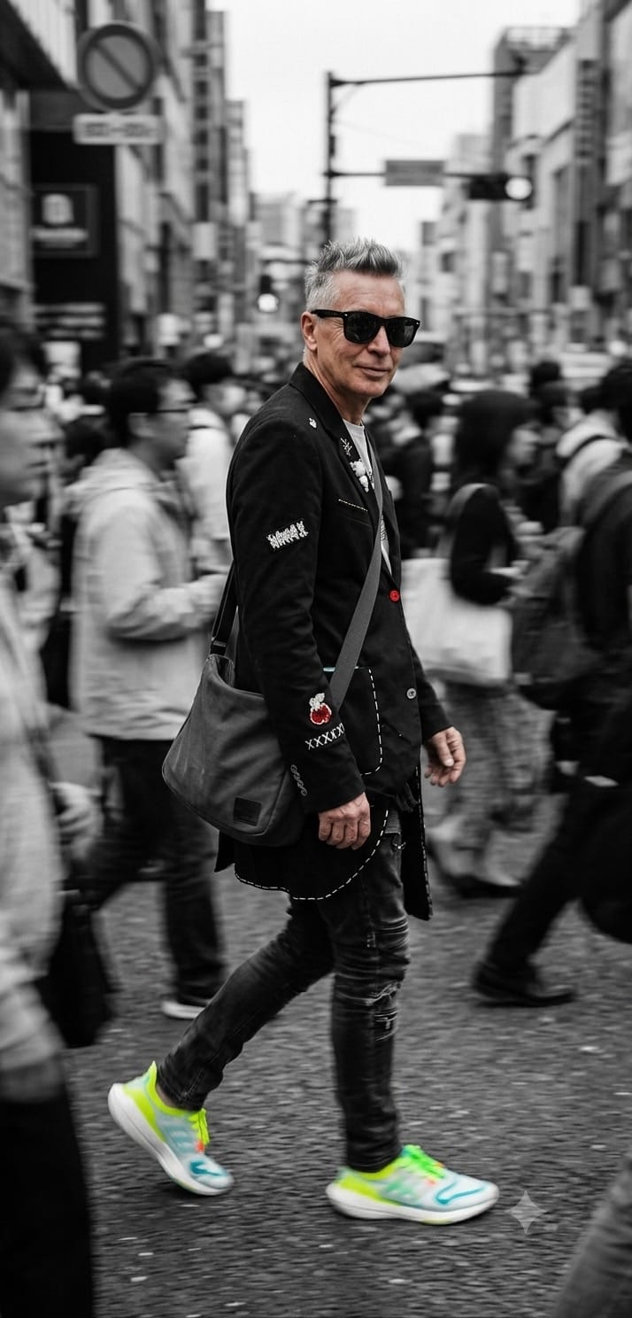
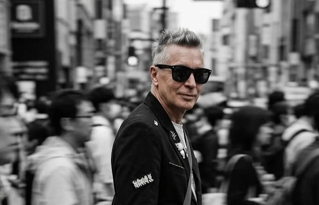
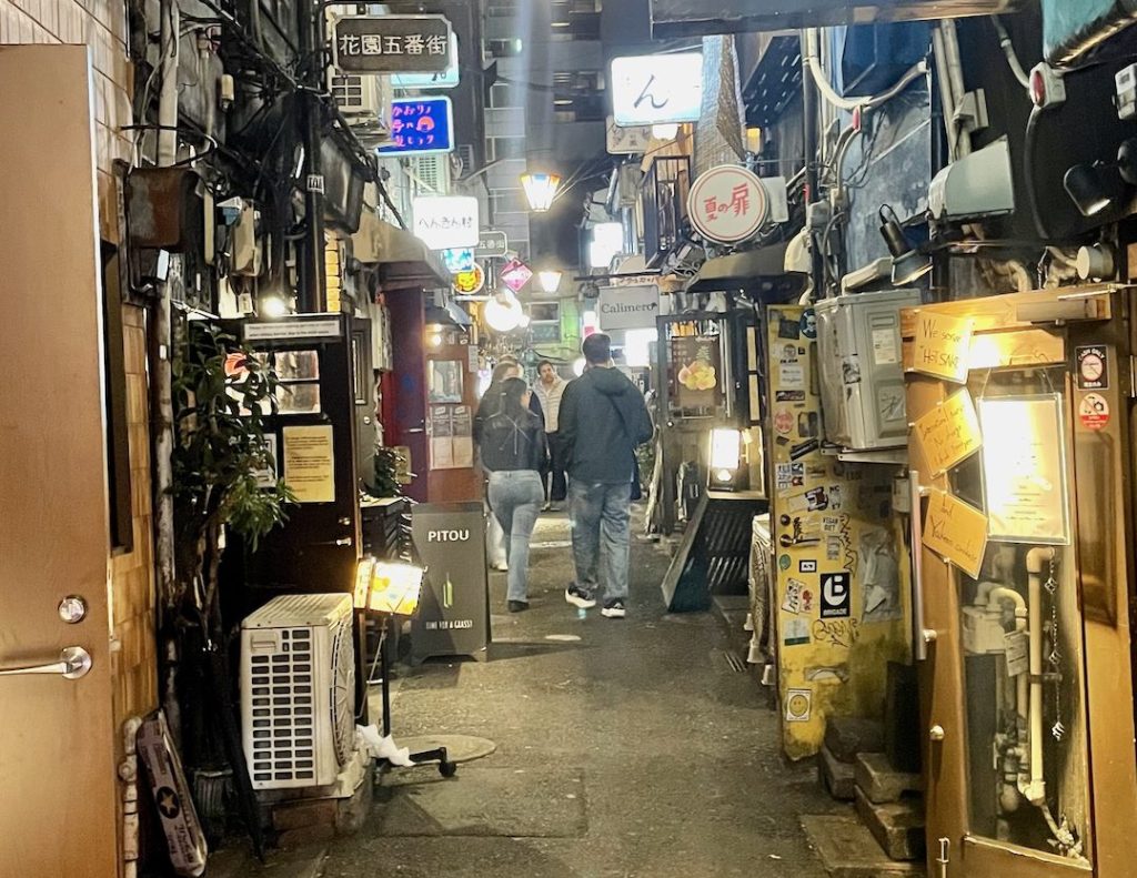
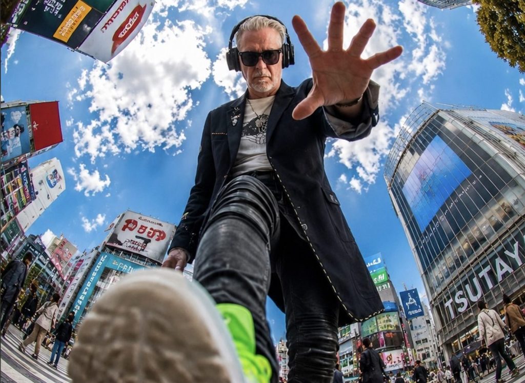
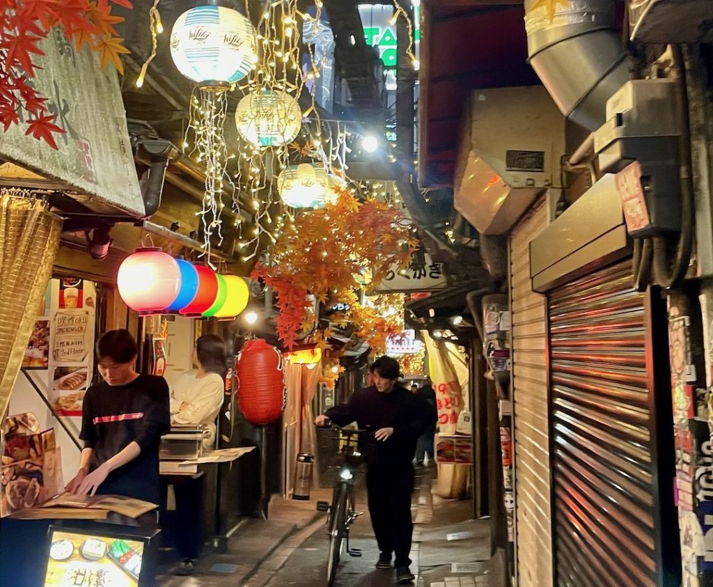
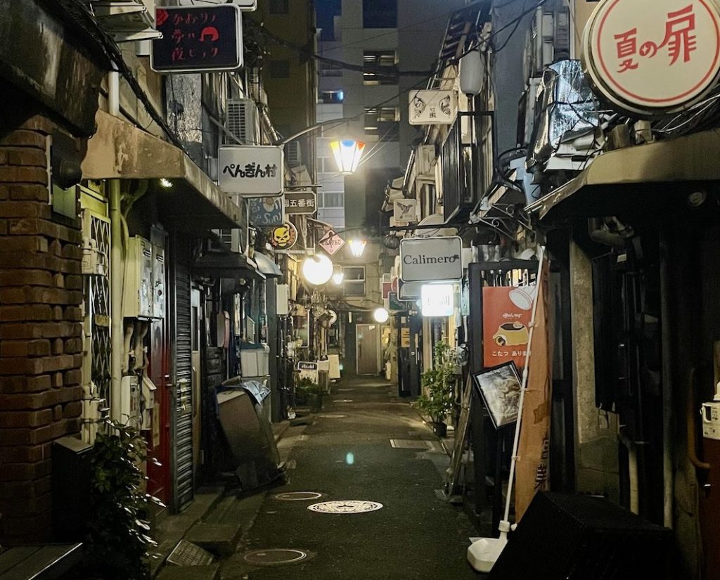
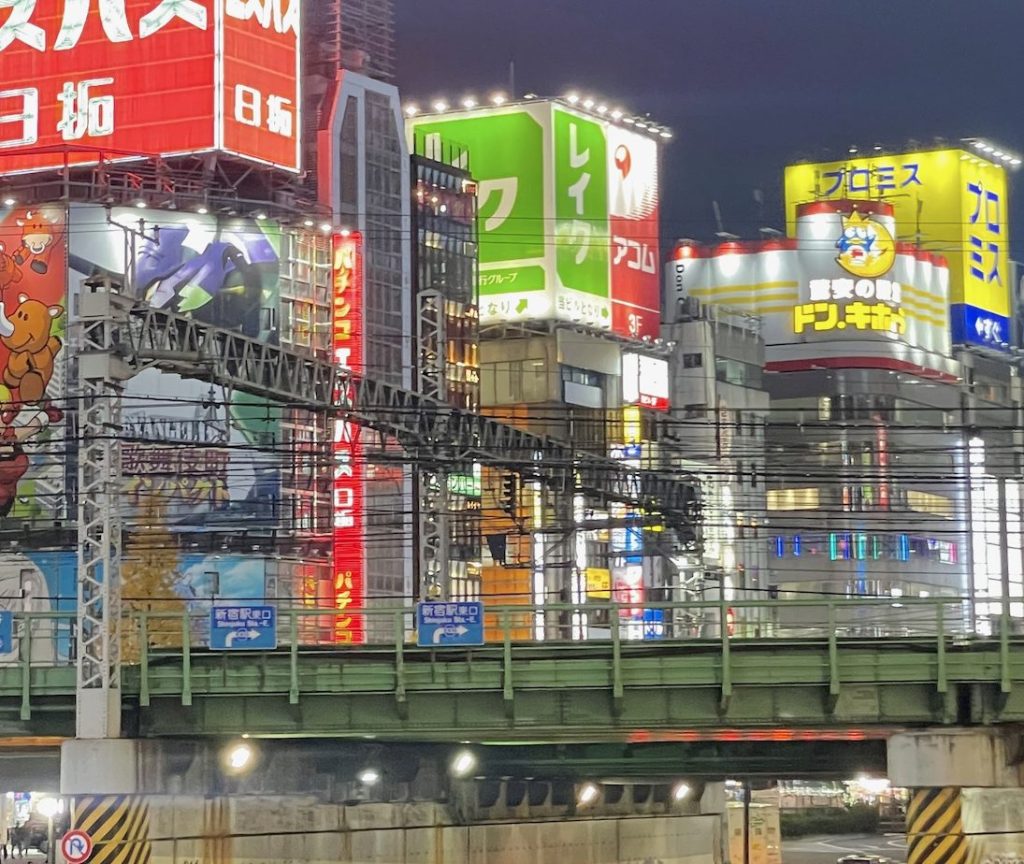


 Borna Libertines
120h to Tokyo
LP · 8 Tracks · 2026
· 138–140 BPM · Underground Techno
Tracklist — 30s Preview
Listen & Buy
Borna Libertines
120h to Tokyo
LP · 8 Tracks · 2026
· 138–140 BPM · Underground Techno
Tracklist — 30s Preview
Listen & Buy